
A Bright Spring Cleaning
In the previous parts, we learned that Seasonal palettes are incomplete in terms of hues, mostly as a result of the wrong assumptions about undertone. In this article, let’s look a little closer on what is actually going on inside a palette.
In part two, we encountered a lavender purple in the cool True Summer palette that turned out to be pure warm in temperature. The same warm lavender hue, adjusted for brightness, is also often seen in the cool True Winter season. It also occurs in the warm True Autumn, and in several neutral temperature Seasons besides. The fact that the same hue occurs in multiple palettes, all with very different temperatures, should raise questions!
Since we know now that lavender purple is warm, we know it is correct in True Autumn, and incorrect everywhere else. Warm colours are not supposed to be in True Summer or True Winter, which are presented as pure cool. Curiously, there is no lavender purple in True Spring, where it should have been included.
So for this part of our series, let’s look at what actual temperature and tonality the colours in a given palette have. Are there many cases like the lavender, where it is included in the wrong place?
I’m using Bright Spring as an example. Since I don’t own a physical copy of Bright Spring anymore, I found an online picture of one particular Bright Spring palette and digitally eye-dropped the colours. I then resorted them for temperature and tonality, and counted how many ended up in each category. We need to allow for some margin of error, since all of this was done on a screen, and screens always differ from how a palette looks in real life.
Here are the results:
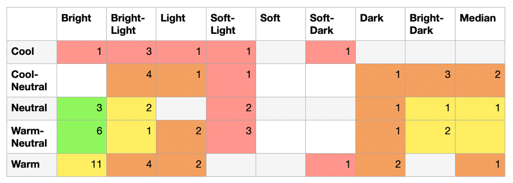
Ideally, we would expect most of the colours to be in the Warm-Neutral Bright (Sphere D1) and Neutral Bright (Sphere C1) categories, since those are what Bright Spring is supposed to be. This is our green zone, and should form the core of the palette. The reality is that a lot of the colours spread out a quite a bit further. We have only 9 colours in the green zone.
However, it is probably for the best that Bright Spring takes on a couple of colours from its direct neighbours, in order to fill the colour space that is not covered by 12Seasons (see previous article). While these colours are already less ideal for genuine Bright Spring people, there are others that do need them. Many of these people will have to be compromised into Bright Spring because they have nowhere else to go. The palette can serve more people that way.
Examples are the Warm-Bright (E1) for example, or the Warm-Neutral Median (D5). These cells are coloured yellow and have 18 colours together. Together, that makes 27 colours that are in the ‘Greater Bright Spring Area’.
When we spread further still and reach two steps away from Bright Spring, I admit I’m not really comfortable with that. An example is the Cool-Neutral Bright-Light (B2): having cool-neutral colours in Bright Spring just feels wrong.
What’s more, some of these categories are already covered in other seasonal palettes. For example, having colours in the Warm-Neutral Light (D4) category is not necessary, because that’s where Light Spring lives. These categories are labeled orange. Collectively, the orange cells contain 24 colours.
Going even further away is a hard no, in my opinion. Cool colours have no business being in Bright Spring whatsoever, as do the Soft-Light and Soft-Dark tonalities. Nevertheless, we have 14 colours in this red zone.
All in all, the spread is rather large. I personally would like a lot more colours (at least 50%) to be in the green zone, and to have significantly fewer in the orange zone, and absolutely none in the red zone. Instead, the red and orange zones together have 38 colours: 11 more than the green and yellow zones together.
Which means that the majority of Bright Spring isn’t actually Bright Spring – at least in my digital experiment. If we take into account that my online swatching was probably less than ideal, the more cautious conclusion is that the Bright Spring palette is probably more random than it should be.
All of this doesn’t just apply to Bright Spring. I tried this exercise with other palettes, and it was the same story everywhere. Every temperature and at least half of the tonalities popped up in every palette. In the cool-neutral Bright Winter, the pinks reach all the way to warm. In True Autumn (Warm Soft-Dark, E8), the limes are Soft and the green is pure cool.
In conclusion, Seasonal palettes are not always ‘what it says on the tin’.
Nevertheless, I believe it is important that a palette contains what it is meant to. The very purpose of a palette is to communicate to a client which colours are relevant to them. I will never expect a client to know that one particular colour is in their ‘orange zone’, because it happens to be a fair bit cooler/warmer/brighter/softer/lighter/darker than it should have been- except that they will find out, eventually. The hard way.
Therefore, the Sphere palettes contain only colours with their exact temperature and tonality. There’s not even any need for a palette to do double duty for the neighbouring category, since all categories are covered from the beginning.
Reason 4: Seasonal palettes contain a lot of colours from other temperatures and tonalities.
So instead: Sphere palettes are tightly calibrated to contain only their own temperature and tonality.
Now that we’ve cleaned up all the colours that shouldn’t be in a palette of a given temperate and tonality, in the next part we’ll look at what colours should be included, as I continue creating the Sphere palettes.