
Category: Colour

  • What Colour Harmony Looks Like

    How to know when you are wearing the right colours

    You may have heard of colour analysis. You may have even had an analysis. Then at some point, you will end up staring at your reflection in the mirror, and wonder: Is this colour really right for me? And how can I tell? 

    The purpose of colour analysis is to find the colours that look good on you – the colours that are harmonious. But what does that look like? How do you know when colours work, or not? How you do you know your analysis was correct? How can you do this for yourself at home?

    In this article, I’m going to teach you what to look for, so you can see and judge colour harmony for yourself. 

    Part 1 What is colour harmony? 

    Before we explore what colour harmony looks like, we first need to learn what colour harmony is. 

    Colour harmony is NOT colour preference: whether you like seeing particular (combinations of) colours. It’s quite possible to have harmonious combinations that you don’t like, and also to appreciate combinations even though they are not harmonious (of course the combination will look significantly better when it actually is harmonious).

    Colour harmony is objective and measurable, unlike personal preference, which is relative and will vary between people. Fashion and art people often get confused between these, which is understandable as they don’t have the scientific skills to handle the distinction. 

    Second, colour harmony is also NOT about colour seasons. Seasonal colour analysis is probably the most well-known attempt to group colours together into supposed harmonious combinations. I have years of experience working with seasonal palettes. However, when I researched colour harmony more deeply in the last few years, I found seasons to be overly simplistic, shockingly incomplete and founded on incorrect assumptions. (Read more here if you’re interested in learning why > link to 12reasons articles). Naturally, I chose to abandon the seasonal palettes. I developed my own Sphere palettes instead. 

    However, researching the seasons did provide me with insight into how colour harmony actually works. 

    It’s about colours sharing the same temperature and tonality. 

    Temperature is determined by what hue a colour has, and can turn out warm or cool or somewhere in between. I don’t mean absolute temperature, where red/orange/yellow are considered warm, and green/blue/purple are considered cool. Instead, it’s about relative temperature: warm and cool versions within each hue.

    I find yellow to be the easiest hue to imagine warm and cool versions of. Warm yellow is buttery and orange-leaning, while cool yellow is acidic and closer to lime green. All hues work like that, they each have warmer and cooler versions. So you can have, for example, a neutral orange, as well as a warm blue. 

    Next, tonality is about the ‘paint medium’ that carries the hue, or pigment. We might have a clear medium that lets the hue shine through in full force. That makes bright colours, and a Bright tonality. But we can also have various amounts of white, grey or black mixed into our medium, which makes colours softer, and also lighter or darker. Generally, tonalities are characterised by how much, white, grey or black they contain. Sphere palettes are divided into Bright, Bright-Light, Light, Soft-Light, Soft, Soft-Dark, Dark, Bright-Dark and Median tonalities. 

    As an example of what different tonalities look like for the same hue, let’s look at red. A Bright red is very clear, like a candy apple or a stop sign. A Soft red contains a lot more grey and will look like terra cotta stoneware. A Dark version looks like very deep tomato red. Finally, the Light tonality has its translucent wine gum red. In between those are Bright-Dark red, which resembles a fire truck; Soft-Dark, which has brick red; Soft-Light, which leans towards salmon (technically salmon is an orange, please imagine a red hue instead – finding good words to describe colours with is hard!); and Bright-Light red which is akin to strawberry. See Fig. 1 for what these colours look like. 
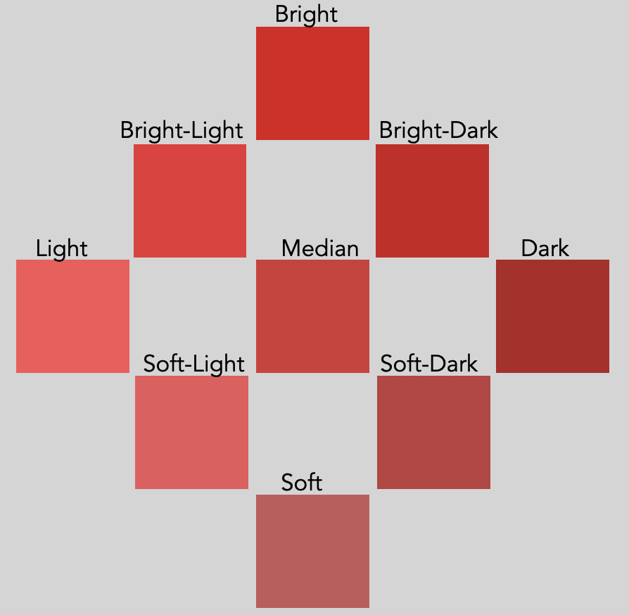
     Figure 1: Red in 9 different tonalities

    When we know what temperature and tonality a colour has, we can pair it with any colour of the same temperature and tonality to create a harmonious combination. 

    For example, if we want to pair a cream colour with some of these reds, we would need subtly different creams for each. In Figure 2, I’m showing three examples for various tonalities: dairy cream with the strawberry red (Bright-Light tonality), parchment for the brick red (Soft-Dark), and oat milk for the firetruck red (Bright-Dark), for example. 
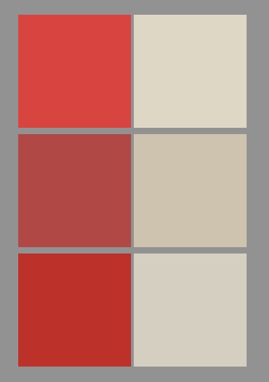
    Figure 2: Red with cream in harmonious pairings. From top to bottom: Bright-Light, Soft-Dark and Bright-Dark

    Part 2 Looking at colour harmony

    Now that we know what colour harmony is, we can focus on what it looks like. We will be considering only solid and clear colours again for this section.

    So we find that when colours have the same temperature and tonality, they are harmonious and coexist easily. These colours you can see side by side, and observe them simultaneously. These colours appear exactly as they are, without straining or clashing. 

    When colours have a different temperature, tonality or both, they are not harmonious and they visually clash. You will have to strain your eyes to look at both colours at the same time, and your vision will side towards on one over the other, or more likely, steer clear entirely and look elsewhere. These colours can’t settle as they are, and your eyes can’t see them comfortably. 

    And there’s something else that happens. An undertone appears. This is our signal that the colour combination is not harmonious. 

    ‘Wait’, I hear you say, ‘didn’t undertone signal colour harmony? My colour analyst said that I was supposed to look for an undertone when I’m looking for my colours.’ 

    Ironically, yes, that is true. You do need to look for an undertone when you’re swatching colours – except that you DON’T want an undertone to be there. Undertones are, in fact, the indicator of disharmony. 

    The idea that an undertone is a sign of colour harmony is a hangover from seasonal colour analysis, which is incorrect on so many fronts, I wrote a 12 part article series about it. 

    There is another kind of undertone too, which is a result of omitting colours from a palette. This doesn’t create a problem for colour harmony. It merely limits your options. 

    Back to colour pairings. A balanced pairing has no detectable undertones: colours simply coexist. An unbalanced pair develops an undertone in one or both of the colours. It’s like the colours are trying to ‘shed’ a part of themselves. The part of the colour that doesn’t fit with its neighbour, the part that gets in the way, that becomes the undertone. And this is where we learn to look. 

    Let’s create some examples. 

    Imagine an acid, lemon yellow, and combine this with a super bright tomato red (Figure 3). That doesn’t make a balanced pairing because these colours have opposite temperatures. The yellow is very cool, the tomato red is very warm. The tomato red develops an orange undertone, since the lemon yellow requires a more pink/blue-leaning red. The yellow, in turn, acquires a green undertone. The tomato red wants a far more golden version of yellow. These combinations are shown in Figure 4. 

    |
    |

    Figure 3: A disharmonious combination: cool yellow with warm red. Depending on where you focus your eyes, you will find an orange undertone in the red, a green undertone in the yellow, or both. 

    |
    |
    |
    |

    Figure 4: Red with yellow in harmonious versions: cool on the left, warm on the right. 

    This example is about undertones in hue, from a mismatch in temperature. From the previous section, we also know that colour harmony requires similar tonality (the ‘paint medium’ that carries the hue)

    When we have combinations of the same tonality, colour pairings appear bright, clean, full-bodied and generous. With disharmonious combinations, colours appear with a white, grey or black cast, or are overbearingly loud. 

    Here is an example (Figure 5). This pairing is of a Soft-Light blue with a Bright-Dark red. And it’s not pretty. The red is heavy and overbearing, with a black undertone. The blue is pale and washed out, with a white cast.

    |
    |

    Figure 5: Another disharmonious combination: Soft-Light blue with Bright-Dark red

    To make the red with blue pairing more balanced, we need to either pick a Soft-Light red to go with the blue, or a Bright-Dark blue to go with the red. In Figure 6, we can see what those look like. Neither causes too much white, black or grey to appear in the other. 

    |
    |
    |
    |

    Figure 6: Harmonious blue with red: Soft-Light on the left, Bright-Dark on the right. 

    So far, we have seen an example of a mismatch in temperature, and one for a mismatch in tonality. However, both can be off. Obviously, that looks much worse. 

    The example in Figure 7 combines pink with orange, which which human eyes tend to be quite sensitive to. It makes for a particularly offensive pairing. 

    |
    |

    Figure 7: Disharmonious pairing of a cool, Soft orange with a warm Bright pink

    Focusing on the pink causes a heavy grey undertone to appear in the orange due to the difference in tonality, and it also has a yellow undertone due to the difference in temperature. Focusing on the soft orange makes the pink overbearingly loud, and much too red-leaning to make a balanced pink. 

    Therefore, this is what it looks like when I pair them up correctly: a cool Soft pink to go with the gentle orange, and a much warmer Brighter orange to balance the pink (Figure 8). 

    |
    |
    |
    |

    Figure 8: Orange with pink, two ways: cool and Soft on the left, warm and Bright on the right. 

    Just for fun, let’s see what it looks like when flip the temperature and tonality, and I create a warm and Soft pairing, and a cool and Bright one (Figure 9). 

    |
    |
    |
    |

    Figure 9: Orange with pink, two more ways: warm and Soft on the left, cool and Bright on the right. 

    Any of these combinations of orange with pink would work wonderfully in for example a floral print. But you wouldn’t want to mix them up! 

    The orange with pink in Figure 7 was very obviously disharmonious, as a result of totally opposite temperatures (cool vs warm) and opposite tonalities (Bright vs Soft). 

    However, sometimes the disharmony is a bit more subtle. When I pair blue and green together, which human eyes tend to be a bit less sensitive to, and I keep the difference in tonality and temperature a bit smaller, this is what that looks like (Figure 10): 

    |
    |

    Figure 10: A subtly disharmonious pairing: a warm Bright-Light green on top; on the bottom, a warm-neutral Light blue. 

    The disharmony is there, but it’s rather small: the temperature and tonality each differ only one step (warm vs warm-neutral, Bright-Light vs Light). However, you might still be able to see a white undertone in the blue: it is slightly softer and paler. Because blue is naturally darker than green, the blue doesn’t so much appear lighter next to this green. But perhaps you can see that the harmonious blue that this green wants, would be a little fuller and richer, and also a smidge darker 

    The disharmony in temperature is even more challenging to notice, and is easiest to see from the perspective of the blue: it makes the green ever so slightly too yellow. 

    All in all, these differences are very slight, and I won’t expect you to be able to see much if this is your first try. This really is a hard one! 

    Let’s now create the correct pairings and see what they look like (Figure 11). 

    |
    |
    |
    |

    Figure 11: Corrected pairings of green with blue: warm Bright-Light on the left, warm-neutral Light on the right. 

    Subtle differences like the example in Figure 10 can still matter. Especially when I’m doing your colour analysis. When we want to find your settings for temperature and tonality, we want to be as precise as possible. 

    However, for a real-world shopping result, this kind of combination is pretty ok (there’s so much worse out there!) and I’d say this is probably close enough. 

    It is good to keep in mind that although disharmonious pairings develop an undertone in one or both colours, the colours aren’t actually doing anything. These effects are happening in your mind. They are a result of human eyes and brain processing vision. In this article, I’m describing the experience of looking at colours with human eyes, not any physical traits or behaviour from the colours themselves.

    Now that we can test colour harmony in solid/flat colours, in the next section we’ll move on to what it looks like for your face. 

    Part 3 Sensing colour harmony 

    Colour harmony with human skin is a little more complicated than with flat colours. The principle remains the same, for course: the colour we’re wearing has to have the same temperature and tonality as the colours in your skin, for colour harmony to occur. 

    The difficulty with skin though, is that it has multiple colours at the same time, all layered on top of each other. We want all those colours to easily coexist with the colour you’re wearing. However, there are too many at the same time to really see what’s going on. What’s more, natural skin colours are really muted (close to grey), which makes them difficult to gauge. Differences in temperature or tonality don’t stand out as much. All together, undertones will be difficult to spot. 

    Colour harmony, when it involves human skin, is no longer about looking. We will need to take a step back from the technical approach and address colour harmony in skin in a more intuitive way. And this is where sensing comes in.

    From my previous seasonal training, description we had what colour harmony looks like in someone’s face, was ‘clearing the skin’, which got explained as ‘the absence of negative illusions’. When the colour we’re testing leaves the skin free from excess shadowing, heavy texture, yellowing or redness and various other visual distortions, it is said to be harmonious. 

    And while this is certainly true, I don’t like to define colour harmony by what it’s not. It leads to an inherent contradiction. Because balanced, healthy human skin still has shadow, texture, redness and yellowness. For example, pores are supposed to be part of your skin (they’re very useful!). So how much visible pores is too much? When we try to measure colour harmony by the things that it is not, we’ll be left wondering what level of measurement is acceptable to declare that the measurement isn’t there. 

    Instead, over the years of doing colour analysis and developing Sphere colour palettes, my definition has evolved into the following: 

    Colour harmony is when your skin is able to capture light. 

    When skin can capture light, we are given the impression that the very light appears to slow down and settle inside. The light pools, fills up the skin, and starts brimming over. The skin becomes luminous and painterly. The face transforms, from a picture to a painting. 

    In darker skin tones, this lends an incredible depth and fullness to the skin’s hue, and transforms its natural surface shine from ashen to clear, much like the shine on silk velvet. Comparatively, lighter skin tones are less colourful and more transparent. In disharmonious pairings, that transparency reads as wan and waxy, and transforms to a marble-like translucency in harmonious colour combinations. 

    How does this relate to tonality and temperature? 

    First, tonality is what brings light into your skin. 

    For some people, their skin wants a lot of light, and so colour harmony happens with very light and clear colours (Light tonality). For others, their skin finds these colours way to light and buoyant, and they want more grounded, dark colours. For them, it’s richness and depth that brings light into their skin (Dark tonality). Some people find they balance very gentle amounts of colour, and they still look fully lit (Soft). Others might find they require a very strong punch of colour to bring enough light into the skin (Bright). The other tonalities in Sphere colour analysis (Soft-Light, Soft-Dark, Bright-Light, Bright-Dark) have combinations of these effects. 

    People with Median tonality skin deserve special recognition. They manage to make most Bright, Soft, Light and Dark colours look acceptable. Yet none of them are really satisfying. All these tonalities offer Median skin a small amount of light. Yet none of them really bring enough. 

    For these people, we only find their sweet spot when we stick to the exact middle of the tonality range: neither Soft, Bright, Light or Dark – but instead Median. And suddenly, the light is there, their skin seizes it, and their appearance transforms. 

    Tonality is only half the story for colour harmony. What about temperature? After tonality brings light to your skin, temperature affects how well your skin is able to hold it. 

    It’s like the difference between a bowl and a colander. You can pour water into a bowl, and the water will stay there. That’s what the right temperature does: it allows the skin to hold on to light. 

    The wrong temperature is like the colander: sure, you can pour water into it, but it’ll pour out almost as quickly. The skin can’t hold on to the light, which appears unstable and fleeting. 

    So when you have the right tonality and temperature, they work together. The tonality will offer the right amount of light to your skin, while the temperature enables your skin to capture it. When both are at the right setting, that’s when your skin fills up and flows over with light. 

    I highly recommend trying many different colours on yourself, and practice sensing what your skin does in response. Your clothes, but also household objects, all have colours. Hold them close to your face, and watch your skin change. Does the colour let you capture more or less light? Can it get too much? And what colours allow your skin to hold on to light? 

    The purpose here is to train your eyes to become sensitive, and thus learn to sense. However, don’t draw conclusions about your own temperature or tonality too quickly. You might find a colour that lets your skin hold on to light, but it may not be obvious what properties it has. 

    Every colour occurs in a version for every temperature and tonality. Not every pastel belongs to the Lights, and not every dark colour belongs to the Darks. Not every rust brown is warm, not every sky blue is cool. 

    Which is why Sphere palettes contain so many colours: every hue, in a clear, pastel and dark version is depicted, alongside their appropriate neutrals, while all carefully calibrated for temperature and tonality. 

    A note about hair and eye colour. Do these play any part? Not really. You can safely assume that your hair and eyes will look fresh and colourful when your skin is able to capture and hold light. If anything, your eyes and hair are probably more tolerant than your skin is. I was taught, back when I was a seasonal colour analyst, that if the skin is in perfect balance, the eyes and hair are automatically too. To this day, I’ve found that to be completely true. 

    Another note: I am once again describing the visual experience of colour harmony in someone’s face, not the physics. Capturing and holding on to light, in physics terms, means absorption of photons. In that case, nothing would get reflected, consequently no light gets detected by the viewer, and the resulting object or person appears dim. That’s not what I mean. I am trying to convey to you the experience of sensing colour harmony, not the mechanics. 

    Part 4 Seeing colour harmony

    In the previous part, we learned how to sense colour harmony with your skin. However, there is another piece to that puzzle. 

    We can consider the effects of a colour on your skin, but there is also the effect of your skin back on the colour. And that colour IS a flat colour. Which means it’s by far the easiest to judge colour harmony by. 

    And because we now can sense when the skin can capture light, we can once again look at the colour. This time, we’re not just looking though. When we look and understand what we’re looking at, that’s when we are seeing. 

    To summarise: imagine we have a colour, a drape, garment or other item, that we hold under your face. When the colour is harmonious, not only your skin appears as though it can capture and hold on to light. The colour too, should appear to full effect as well. 

    The beauty about Sphere palettes is that temperature and tonality are laid out independently. We can work on one and ignore the other for the moment. 

    So let’s start with tonality. We want the colour to simultaneously appear: 

    • clean (bright enough)
    • clear (light enough)
    • generous (soft enough)
    • full-bodied (dark enough)

    A colour that doesn’t look clean, instead will look washed out, worn out, dirty or faded. Too much grey is coming through: in other words, a grey undertone has appeared. Your face requires a brighter colour. 

    A colour that doesn’t look clear, instead shows up as heavy, weighed down and dim. The colour has too much black in it: a black undertone emerges. Your skin requires the colour to be lighter. 

    A colour that doesn’t look generous, instead comes across as overbearing, takes up too much space and draws too much attention. We have to strain to really see you. It has too much brightness, and we need it to be softer: a little more white, grey or black to mellow out the brightness with. 

    Finally, a colour that doesn’t look full-bodied, appears thin, pale, floaty and disconnected from you. There is a white undertone that gets in the way. Your skin requires the colour to be darker. 

    Colour analysis is about tuning the dials of softer/brighter and lighter/darker until we find balance. That’s how we find your tonality. 

    Next, when we are testing for temperature, we want the colour to simultaneously appear: 

    • fresh (cool enough) 
    • happy (warm enough) 

    Temperature is about hue. When a hue looks fresh but not really happy, the colour is probably too cool. If a hue looks happy but no longer fresh, it is probably too warm. 

    If the hue looks very unhappy altogether, that means you are either very far from the temperature that you need, and/or the tonality is completely off. There is definitely crosstalk between these two, and it takes a skilled colour analyst to untangle them. Generally, colour analysis is easy – until it’s not! 

    I hope this article gave you some insights into how colour harmony looks, and helped you judge if it is there. And if it made you curious about Sphere colour analysis, you can find more information about that here. 

  • 12 Reasons Against 12 Seasons | Conclusion

    As we round up all the reasons why seasonal colour analysis is incorrect, this is what we are left with: 

    Seasonal colour palettes: 

    • Are incomplete within (part 1) and without (part 3); 
    • Contain a lot of inconsistent colours (part 4) as a result of an incorrect assumption about undertone (part 2); 
    • Are skewed to contain more pastels or darks (part 5), while in reality they have the potential for a full rainbow of hues in all tonal classes (part 6); 
    • Lack their complete neutral ranges (part 7), while the softer tonal classes are misrepresented entirely (part 9); 
    • Are inconsistent with how colours behave in nature (part 10); and unnecessarily dictate a pre-curated aesthetic (part 12), which makes seasonal analysis prone to analyse for affinity and tolerance, rather than actual colour harmony (part 11); 
    • Are handed to the client in the form of colour fan, the design of which is unsuitable for communicating colour harmony (part 8).

    What does this mean for me? 

    Now I’ve tracked the science behind colour harmony, I’m still surprised, even a bit sorrowful, at how different it is from what I used to know. I loved the Seasons – still do, in fact –  and wasn’t expecting any dramatic changes. I merely hoped I would be able to slightly improve the palettes I was used to. 

    Instead, I arrived in a radically different place. Part of writing this series of articles is me coming to terms with that. Thank you for reading along with me!

    On the positive side, it has been very rewarding to see colour harmonies come together that I previously could only dream of. It has been so thrilling to test, and try, and gradually discover all these new possibilities. I learned so much. What a privilege! And what a rollercoaster! 

    All in all, I feel mostly grateful to the 12Seasons. For their time, they were an impressive step in the right direction. What’s more, the Seasons became the foundation that allowed me to keep learning, which eventually led to building Sphere. It’s like Isaac Newton said; ‘if I have seen farther, it is only because I stood on the shoulders of giants.’

    But for the sake of my clients, I can’t go back. I cannot in good conscience offer seasonal colour analysis ever again – you deserve an analysis that actually works. Although I am totally fine with telling you your Season as part of a Sphere colour analysis (it’s very easy to translate a Sphere result to a corresponding Season). It will be the only way your friends will understand what palette you received, after all. 

    And how about you? How do you feel about learning colour harmony and what’s really in seasonal colour analysis? I would love to hear it. 

    If you’re curious about having a Sphere colour analysis, here is the information.  

    If you are an (aspiring) colour analyst and you are interested in becoming a licensed Sphere colour analyst, I have in-person colour analyst training under development. (Those with 12Blueprints or Sci/Art qualifications have a great basis for draping already and can suffice with remote training.) If you are interested, I am taking inquiries via email. 

    < Part 12 Stories of Soft Autumn

  • 12 Reasons Against 12 Seasons Part 12

    Stories of Soft Autumn

    Which brings us to the final instalment of this very long article series. This one is about storytelling. Storytelling is a huge part of personal style. And this is where undertone comes back in. 

    Storytelling was always the strong suit of the 12Seasons. While the actual colours might not always agree with the supposed characteristics of the palette (part 4), which in turn don’t always agree with colours found in nature (part 10), and thus colour harmony wasn’t always there, the power of these palettes to evoke different moods and settings remains phenomenal. 

    What makes them so good at storytelling? It’s because they were curated for their undertone, which sets the scene for the story. 

    Wait, weren’t undertones bad? In article two, we learned that undertones in individual colours are problematic for colour harmony, because they are result of a temperature clash and thus disharmonious. 

    However, palettes have two ways of creating undertones: by individual colours having undertones (which we don’t want), but also by curating which hues and classes are represented, and which are left out. And that last step something we can certainly do. 

    In fact, curating is what I built the Sphere palettes for. The palette has all your potential options laid out. You get to choose what pleases you, what you like to wear, and build your own undertone from that. 

    Curating is therefore the final step of getting a Sphere palette. 

    The recipe for curating is actually quite simple: pick the colour that best exemplifies the atmosphere you want to create, which is your undertone, and build the rest of the colours around that. Let’s learn from Soft Autumn how that works. 

    The Soft Autumn palette relies heavily on faded reds and oranges, dry yellows, tans, beiges and browns, and pale olive greens, and together those take up around two-thirds of the palette. At the heart of this group sits the tan yellow that we might consider to be the undertone. 

    Some will disagree with me and say the dull red is the undertone, because it is represented more often than the yellow. Nonetheless, I picked the yellow for two reasons: it is located more centrally in the red-orange-yellow-olive green stretch of the colour wheel that takes up that chunk. Secondly, the Soft Autumn neutrals appear predominantly yellow-based. All together, there are more colours ‘looking’ at yellow than there are colours that are ‘looking’ at red, or any other colour. 

    So an undertone is a colour that is represented most or at least a lot, and appears to have influence over at least half of the palette colours, including the neutrals. It doesn’t need to be the brightest colour or even the most commonly occurring, although that certainly helps reinforce it. 

    We can apply the same recipe to your Sphere palette. And because you can choose any colour you want as the undertone, you can create any vibe you would like. No more need for Season envy, ever!

    At this point, you might wonder if that’s really going to work. Doesn’t the tonality and temperature affect what aesthetic your palette can create? 

    Yes and no. The clear red in a Bright palette is always going to be louder than the clear red in a Soft, will be more visible from across the room. 

    However, when we look in context of the palette, within the context of the person: the reds will look the same. The clear red in a Soft doesn’t look soft. The clear red in a Bright doesn’t look bright. Both look just red. 

    This the ‘functionality principle’: any clear red in the context of its own palette, no matter temperature or tonality, functions as just that: a clear red. The same goes for any other hue and class (pastel, dark, neutral etc). 

    However, as much as I already knew about the functionality principle from draping seasons, I didn’t realise what consequences it would have when I started out creating the Sphere palettes. 

    Quite early on, I realised I needed to uncouple temperature and tonality (part 3). With 5 categories for temperature and 9 for tonality, I knew that meant 45 different palettes. Admittedly, that is a crazy high number. I was very worried that we wouldn’t be able to see any differences between them. 

    Fast forward through many months of research and sample making. The palettes start to take shape. And you know what? They all looked exactly the same! When holding them side by side it was easy to see the differences, but by themselves, they all looked the same. 

    At that point I got really worried about it – until I realised this is what is supposed to happen. When palettes are complete, harmonious and correctly calibrated, there are no undertones and neither will there be excess grey, white, black or loudness within any palette. 

    Every colour has the same function relative to the rest of the colours, across palettes. As I now learned all over again, clear red functions as just a clear red, no matter how cool or warm, bright or soft, light or dark a palette is. And so do yellow and pastel blue and dark purple and every other colour. 

    As a result, all palettes look the same, even if side by side they appear wildly different. Which means that all palettes have the same potential for storytelling. The complete potential for storytelling, in fact. You can mimic any Season, or try other stories besides. 

    Depending on how much variety or cohesion you like in your style , you might curate per outfit, or your entire wardrobe. 

    The curating process starts at the end of a colour analysis, but will probably continue afterwards. You will get to experiment with your palette and know your colours better, discover what you like and don’t like, and fine-tune accordingly. On top of that, your preferences will continue to evolve as you grow and change over time. 

    For that reason, clients will receive a more detailed guide on how to create their ideal curated palette from their Sphere. 

    Reason 12: The Seasons are prematurely curated. 

    So instead: Sphere palettes have their complete potential for curating and storytelling. 

    < Part 11 Light Summer in the Dark

    Conclusion >

  • 12 Reasons Against 12 Seasons Part 11

    Light Summer in the Dark

    We’ve covered a lot of ground now. We’ve learned how temperature and tonality come together to create palettes, which include clear versions, pastels and darks of all twelve hues, in addition to their neutrals. What does this mean for colour analysis? 

    You might expect that so many colours in each palette, might make colour analysis more complex. Surprisingly, it does the opposite. What makes the difference is being able to drape independently for temperature and tonality is a total game changer. 

    If the drape colour looks colourful and clean (i.e. the tonality is right) but the hue feels weird (i.e. the temperature is wrong), we can simply make an adjustment only for temperature. We pick up the drape set that belongs to the neighbouring palette that has the same tonality but a different temperature, and see if it’s a better fit. 

    If, on the other hand, the hue looks fine but the brightness of the drape is off, we can keep the temperature and try a different tonality. And because all palettes are in a logical order, it’s super quick to make adjustments. We can simply look at a drape and tell if it is too light or dark (too much white or black will come up) or too bright or soft (colour is louder than the person, or comes up grey). We then move to a palette that has more fitting qualities, lighter/darker and/or softer/brighter, and check again. We follow the logic and hone in on the right palette with every step. 

    Once we come up with a favourite, I will spend a good portion of your analysis doing ‘back-checks’: testing every neighbouring tonality and temperature to see if we really have found the optimal palette for you. I want to be triple sure. 

    And then we have your definitive palette. Which is just the first step, actually. 

    Next, we determine your orientation. This is how your temperature and tonality compare to the palette’s settings. In what direction is your sweet spot, relative to the palette? This affects where you find your ultimate harmony colours, and how you will want to compromise, based on what’s available in stores. If you lean cool for example, then compromising in a cool direction will be much easier than compromising in a warm direction. If you are located dead-centre in the temperature range, it matters less which way you compromise, and only how far. 

    Next, there is affinity. This is about what regions of your palette you have particular affinity with. While every singular colour is technically harmonious (and won’t induce any negative effects in your skin, such as shadowing, redness, etc), they won’t all look equal. There are hues that are just fine, and there will be those that are staggeringly beautiful. 

    This might be certain hues or entire tonal classes. The hue of your eyes will likely be among them, but there will be more. Affinity also determines your tolerance for colours from outside your palette. Blue-eyed people will likely have affinity with their blue and look truly fantastic in it, but also look half-decent in blues from other palettes. 

    Affinities can be surprising, too, or even appear contradictory. To use myself as an example, my clear colours look lovely, my pastels look nice, my neutrals look fresh and clean – but nothing beats my dark colours for how good they look. Yet my tonality is on the lighter-leaning side. I am a Sphere B2, which is the cool-neutral (B) Bright-Light (2). 

    If dark colours look so good, should I have put myself in a B3, the cool-neutral Bright-Dark instead? Obviously I’ve checked this, and the answer is a resounding no. The Bright-Dark clear colours eat me alive, way too thick and deep. And those dark colours are blackened well beyond what I can balance. I end up looking pale and sad.

    Another example of affinity appearing contradictory is a woman who was analysed as a Dark Autumn (Warm-Neutral Dark, D6), but who doesn’t sit comfortably in the palette and can also wear really cool acid yellows. I’m not entirely sure yet, but she might turn out to be a cool Dark (A6) and just have really strong affinity with, and thus tolerance for, olive, camel and rust brown. 

    Which begs a question: how many people are appointed a certain Season because of their affinity rather than their tonality and temperature? Seasonal colour analysis is not equipped to handle that distinction. 

    Draping me in 12Seasons gives Bright Winter as a clear winner, leaving behind Light Summer by quite a margin. Even Dark Winter looks better than Light Summer. Surely, in that comparison, my affinity with the darks tonal class is overpowering my harmony needs. 

    And that makes our next reason against 12 Seasons:

    Reason 11: Seasonal colour analysis can confuse affinity and tolerance with colour harmony. 

    So instead: Sphere colour analysis carefully tests for harmony, orientation, affinity and tolerance. 

    For all that seasonal colour analysis genuinely tries to be scientific, the colour science just wasn’t available to make it possible – I had to research it myself to get the information I wanted. It mostly runs on vibes, instead. 

    Speaking of vibes, that will the topic of our final article in the series. 

    < Part 10 The Truth About True Autumn

    Part 12 Stories of Soft Autumn >

  • 12 Reasons Against 12 Seasons Part 10

    The Truth About True Autumn

    As mentioned previously, after leaving you with the fact that Seasonal colour palettes are not supported by colour science, you might want to ask the obvious question. Don’t seasonal colours occur in nature? The colour science I’ve presented might debunk the seasonal palettes, a couple times over in fact. However, if these colours consistently occur together in nature, that likely indicates the science is wrong, and not the Seasonal palettes. 

    It is true that colours that occur together in nature are often harmonious. But that goes for a singular organism, like a plant or animal. So how about colour palettes that take their inspiration from an entire period of the year? 

    Since we have four seasons throughout the year, I’m going to simplify and consider only the 4 major Seasonal groups in their total, rather than separately as 12 Seasons.

    Starting with Spring, what are the natural phenomena that are associated with this warm, bright and light colour palette? Sunshine, springtime flowers, especially bulbs, new growth in plants, tropical beaches and fruits are what come to mind. 

    Among these, we can immediately discount tropical beaches – they are not a springtime phenomenon. Tropical regions don’t even have four seasons the way temperate regions do. 

    The fruits that are associated with Spring don’t qualify either. Generally speaking, seasonal/temperate regions of the planet don’t have fruit during springtime. Raspberries, for example, are a summer fruit. Watermelon is tropical. Citrus fruits ripen during winter time. Ironically, many citrus fruits are cooler oranges anyway, which would actually confirm this seasonal theory for the cool and bright Winter palette – except that orange is not supposed to occur in Winter at all. 

    Continuing with springtime flowers, crocuses come in a warm bright golden yellow, warm bright purple and warm and light creamy white. Crocus pistils are a bright warm orange. All of these are classic Spring colours, and thus confirm the seasonal theory. 

    On the other hand, daffodils are a cool acidic lemon yellow, and whenever they have orange in them, it’s a cooler orange too. While the brightness lines up well with Spring’s qualities, but the temperature does not. 

    Springtime’s new plant growth does concur with the lime and sap greens classically found in Spring. 

    Sunshine, meanwhile, is more typical for Summer than Spring, as is warm weather. In addition, the colour of the sunlight gets more golden the lower the sun is in the sky, but during Spring the sun sits at intermediate to high levels in the sky. By that logic, Winter should have the most golden colours, because the sun is lowest during that season. 

    The day lengths are long in Spring though, so the lighter quality of the Spring palette does agree. 

    Moving on to cool, soft and light Summer, there are the summer florals, blue skies, green foliage and a large amount of daylight that are associated with the summer palette. 

    The temperature is an obvious clash: the summer season is warm, the summer palette is cool. 

    The temperature of the light does agree with the summer sun being highest in the sky, which causes a larger amount of blue photons to pass through the atmosphere and therefore the light is cooler. The amount of daylight checks out too: the Summers are lighter palettes. 

    The blue skies are cool too (it’s the same blue photons scattering in the atmosphere), while the summer greens have a variety of temperatures – cool ones are among them, but so are warm ones. 

    Summer flowerings are often from plant families that flower with white, pink, purple and blue. An example is Hydrangea. However, there are many others that have colours from outside the palette. Eonymus, commonly called spindles, have a cool and bright magenta flower with (yet another) cool bright orange centre, which blooms in July but the colours are Winter (minus the offending orange, of course). 

    As an aside, do all flowers of the same species consistently stick to a temperature or tone? No, I’ve seen snapdragons for example, can vary quite a bit in brightness between individuals, while nasturtium plants can vary quite a bit in temperature. All of these are summer-flowering, by the way, but rarely part of the typical summer palette. 

    Continuing with warm, soft and dark Autumn, when deciduous trees lose their leaves, this actually makes the strongest case for seasonal palettes. Most leaf colours do land in the Soft and Soft-Dark (= Autumn) tones during the yellow and red phases, as well as the warmer palettes. However, does the brown phase of dead leaves of all species exclusively belong to the warm, soft and dark palette? I’m not sure, I’d have to look next October to see what temperatures are among them. 

    There is less daylight in Autumn, so the dark quality of the palette agrees with that. As far as the warmth goes, the weather (moderately cold)  nor the angle of the sun (halfway) give any convincing argument that the autumn palette should be warm. 

    In addition, Autumn has its harvest colours, fire (hearth, stove) and warming spices. Many of those spices are again tropical, so not an argument for Seasons. Obviously, the colours of fire have very little to do with the time of year: summer campfires have the same colours. Many harvest colours, apples etc, do in fact agree with the Autumn palette. 

    Finally, the cool, bright and dark Winter palette is associated with snow, ice and general cold weather; bare trees, aurora, and evergreens. Evergreens and tree trunks are practically the same colour year-round, so don’t make any argument towards any specific palette. I do suppose these colours stand out more in Winter. However, the actual colour of most evergreens is a warm green.  

    Snow and ice are a bright white and have have a cool blue cast to them when in shade, so that does agree with the palette. 

    I’ve never seen aurora in person, so can’t really speak of its hues. On video though, it does have the light iciness you expect for Winter. 

    From this whirlwind tour of anecdotal examples, we can conclude:

    • When it comes to characteristic hues and ‘undertones’ from palettes, it’s just as easy to find examples of seasonal colours in nature that concur as well as contradict the seasonal palettes. 
    • The supposed reasons for temperatures are different for each seasonal palette: Winter is cool because of the weather, Summer is cool because of the angle of the sunlight, Autumn is warm because browning foliage and pumpkin soup feels cozy, and Spring is warm because of a renewed appreciation for sunlight after the cold months, even though you still need a coat (both the air temperatures and the angle of the sun are still halfway). 
    • The Bright and Soft qualities of palettes: are all over the place. Summer flowers can be bright, while the palette is soft. Spring hyacinths are soft, while the palette is bright. Winter is the most colourfully contrasting palette, while winter landscapes are the most drab. 
    • Light-Dark qualities of palettes: are fully consistent with the seasons. 

    All in all, while Seasonal palettes certainly mimic how colours behave in nature during the year, they are not consistent in doing so. What’s more, nature is complex and varied, and the seasonal palettes are simplistic. (Examples are no cool orange anywhere, and every dark brown must be Autumn). Perhaps because of that simplicity, the storytelling is phenomenal. But we shouldn’t take these palettes literally. 

    Reason 10: Seasonal palettes are not consistent with observations from nature. 

    Now, I have another note about seasonal colour palettes not being dictated by the natural world. If seasons were real, colour analysis at large would be apparent for everyone, and would generally be taken more seriously. Most people treat it as a whimsical, rather fanciful thing you might consider if you feel like it. From what I’ve learned in the past three years, they are right. Seasonal colour analysis is not the scientific discipline it was pretending to be. 

    Particularly with makeup, it would be obvious that certain shades of makeup don’t work for the majority of people. Take for example brown eyeshadow. 

    If Seasons were real, then that brown would belong to Autumn only and no-one else, because none of the other Seasonal palettes can convincingly absorb an Autumn brown. Their tolerance for that brown would be non-existent. We would then only have people that look really good in it, and people that looked ridiculous. And crucially, no in-between group for whom the colour is almost wearable, but not quite there. 

    Now, real-life results prove the opposite. We have indeed people for whom the brown works brilliantly, and those who try it, it turns out horrible and they take it off the next second. And we will also have people for whom it’s not perfect but still wearable, or for whom it’s close but not quite wearable, others for whom the brown is a stretch but fashion, hey?, and those that would rather not wear it, but there are still worse options. In short, there will be varying degrees of success, not just the two extremes. 

    Knowing what we know now, we will have people that resonate with the colour effortlessly, and those for whom the tonality is right but not the temperature, or the other way around, or a bit of both, or a lot of both. Temperature and tonality are independent variables, after all. 

    To complicate matters, brown eyeshadow isn’t just one colour – it comes in many versions, of all temperatures and tonalities. It’s merely a matter of chance if the shade with the temperature and tonality that you need, is going to be the one that you end up buying. 

    Therefore, it’s not a simple as saying ‘you don’t look good in this dark brown, so you can’t be an Autumn’. The brown that you may be testing may actually be a Cool-Neutral Bright-Dark (B3), rather than the Warm Soft-Dark (E8) that Autumn is supposed to be. Without proper colour science to understand what brown you are testing, how would you tell? 

    Which is going to be the topic of the next article: what colour analysis really is testing. 

    < Part 9 Softer than Soft Summer

    Part 11 Light Summer in the Dark >

  • 12 Reasons Against 12 Seasons Part 9

    Softer than Soft Summer

    If you felt that the information about colour harmony in this series of articles is radically different from the concept of Seasons, you are right. And it’s about to get even stranger.

    All the previous articles were about how I uncovered how colour harmony actually works, and how that led to developing the Sphere palettes. After nearly three years of research, testing and calibrating, I had the full range of clear colours, pastels, darks and neutrals for all 45 Sphere palettes, in a new and easy to use design.

    Nevertheless, I was faced with a problem: all the clear colours, pastels, darks and neutrals didn’t cover the entirety of colour space. They only added up to just over half. There was a lot left. 

    These colours were too soft to put into any palette as a clear colour, not even a Soft. At the same time, they were too dark to make a pastel, too light to make a dark, and too colourful to make a neutral. I called them ‘the interior gap’, because these colours sat at the centre of my colour charts, surrounded by the clears, pastels, darks and neutrals. And also because these very greyed colours are typically found in interior design (but also in a lot of clothing these days – bright colours have largely disappeared from retail). 

    So why can’t I put these in a Soft palette? Because these colours still look greyed, even in a Soft palette. Yes, there is a lot of grey in a Soft palettes, especially when you compare to the other tonalities. But on the right person, someone who actually needs the Soft tonality, their own colours don’t look grey. They look bright, happy, fresh, clear, clean, rich and full-bodied. Which is exactly the point of a clear colour – not too bright or too soft, just right to be colourful. When there is still grey coming up, it means they don’t belong in the Softs as clear colours. They were sub-Soft colours. 

    Where did the interior gap colours belong? I had no idea. There were so many possibilities. They might make their own softer palettes, separate from the palettes based on human colour interactions that I was making. Because I had my hands full trying to sort out the clear colours, pastels, darks and neutrals, I had only one choice here: to set the interior gap aside for the moment, and research it later. 

    After several years of intense work on the Sphere palettes, they were done. I moved on to prepare my studio gear for working with Sphere instead of Seasons. And there, it was the makeup that confronted me with the interior gap again. 

    There were many eyeshadows, particularly the ‘colourful’ ones like blue or green that were softer than my Soft clear colours. And there were lip colours like that, too. Under 12Seasons, I would have put them all in Soft Summer or Soft Autumn without thinking twice. This time, that wasn’t good enough. 

    So back to research I went. It took a couple months of puzzling, testing, observing, and learning to look at colours once again, plus some hard core theorising. But I ended up with a working model for the sub-Soft, interior gap colours. 

    It turns out that they were several groups of tonal classes, just like pastels and darks are tonal classes. Thinking of them as a kind of grey-based ‘pastel’, helped me realise what these colours were supposed to look like in the context of a palette. Because you are going to feel this coming: of course they went into every single palette. 

    Which means that a lot of the sub-Soft colours that are parked in (mostly) Soft Summer, actually belong in a lot of other tonalities – including the Brights. How incredibly ironic!

    If this breaks your brain, well so it did mine. Much like how I felt when I realised there were Autumn-like colours in literally every palette, except this was even worse. Because there still remained a tenuous link between the Seasons and Spheres. Reconstructing the vibes of a Season from the closest Sphere analog was still obvious, even if you had some extra Spring-like clear colours and Autumn-like darks to play around with. 

    The best example are the Bright palettes. These have the brightest colours, the iciest pastels and the darkest darks, plus a stark black and white to pair it all with, and that still evokes various kinds of Winter. Whichever colours you pair together, the high contrast and the bright colours will still feel Winter-like. 

    However, apparently we now have sub-Soft colours everywhere, including in the Bright palettes. Which means that we can choose to ignore the clear class and the extremes of the white/cream and (coal-)black range, and have enough very greyed colours left to create combinations that resemble Soft Summer. 

    With the last link between Sphere and the Seasons broken, I can only conclude that there is very little scientific basis for Seasonal palettes as tools for finding colour harmony. I’m not saying there is no theoretical basis for personal colour analysis. The whole point of Sphere is to objectively determine which colours harmonise with a person. 

    But Seasonal palettes should not be used for personal colour analysis. They are definitely better than random colour choices, but not by much. 

    On the flip side, the new sub-Soft tonal class creates even more opportunity to discover, create, play with and enjoy colour. It’s been so much fun going to the thrift store and trying on colours that I never knew I could wear. Suddenly, I am no longer frustrated that retail has gotten so bland -it’s either Soft colours or neutrals that you can buy these days. With my Bright-Light palette, that just left neutrals, I used to believe. Instead, I get to partake in the softer colours and wear mauve, heather and soft willow green – and my skin still looks radiant and clear! 

    Even better, the sub-Soft category red and pink makes the perfect daytime lipstick, a subtle lip colour that creates a classic ‘my lips but better’ effect. Especially for brighter palettes, which only have their bold reds and pinks as lipstick options, plus their rather dramatic darks, it’s a very welcome option. It was the only thing that I felt was missing from my makeup bag. 

    So while the sub-Soft colours broke the last link between the Seasons and Sphere, it’s been a huge step forward. The interior gap was the last piece of the puzzle. I can’t tell you how relieved I am to finally understand colour harmony. I am really looking forward to learning more about these classes and calibrating them for each palette. 

    IMPORTANT: The sub-Soft colours are NOT YET included in the Sphere palettes. Partly because there is no space left, and partly because I still have to calibrate the colours for every temperature and tonality. With 45 palettes total, that’s going to take quite a bit of time. Therefore, I will make the sub-Soft colours for each palette available as a complementary set at a later date. 

    Reason 9: There are sub-Soft colours in Soft Summer and Soft Autumn, which instead belong in every palette as a separate tonal classes. 

    So instead: There was no space or time to include these tonal classes in the Sphere palettes, but they will be made available as an extension set at a later date.

    With the rather dramatic statement that there is very little scientific basis for seasonal colour palettes, I can imagine that many of you are asking: but don’t these colours occur in nature? Doesn’t the fact that Seasonal palettes capture how nature looks throughout the year, validate their existence as natural and harmonious combinations of colour? 

    That will be the topic for our next article. 

    < Part 8 Design and Dark Winter

    Part 10 The Truth About True Autumn >

  • 12 Reasons Against 12 Seasons Part 8

    Design and Dark Winter

    By now, all of the colours for the Sphere palettes, clear colours, pastels, darks and neutrals, are ready and calibrated for each category. But how are they going to be presented in a physical palette? It’s time to consider palette design, and how to communicate colour. 

    I have a confession to make: I’ve always felt I’ve done my clients a disservice when I handed them a palette. 

    The classic fan design is convenient for showing a spread of samples: easy to oversee and observe how each option is different. This works fantastic when you’re selling paints or wallpapers etc., where the client gets to the pick the one that they like best. 

    But colour analysis fans aren’t about picking options from a range. They are about communicating   the range itself: an entire colour harmony family consisting of many individual sections of colour space, connected through shared temperature and tonality. 

    Classic fan design is essentially a cloud of separate dots: loose points in colour space. The Dark Winter palette is a fantastic example: its selection of reds and pinks is vast and a bit messy, containing warmer temperatures than there should be (see also article 4). How do you know if a red in the store is close enough to one of your dots – and therefore inside or outside the colour space area that surrounds the dot? 

    It is possible to know what colours work through harmonising with the fan, but it’s a very steep learning curve. It took me years of practice to get good at it, and I only perfected the skill when I trained as an analyst. Handing over the fan to a client after 10 minutes of practice, felt uncomfortable. So when it came to creating the Sphere palettes, I knew I wanted a design that was significantly easier to use.

    Rather than a jumble of separate points, ideally I’d want want to communicate areas of colour space. Colour space itself is three dimensional, and any sections of colour space that are included in the palette are too. What if we could signal where the boundaries of each of these areas were? Then swatching would just become a simple question: is it inside or outside? 

    Three dimensions are difficult to communicate when we’re printing colours on two-dimensional materials, but two dimensions are perfectly doable. What if we created two-dimensional cards, and dedicate a full card for each hue? 

    For example your red card, we would be able to see exactly the hues that fit your temperature range: from bluest to orangest. The other dimension could run from lightest to darkest according to your tonality, and that way you’d have a two-dimensional cross-section of your entire red ‘blob’ in 3D colour space. That gives you so much more information than a couple of dots ever could. 

    The third dimension that couldn’t fit on the card is the brightness. The idea is that any brightness that is close to the card will be OK, and anything that comes up clearly blackened or greyed, or conversely too loud, is not. 

    So two dimensional cards would be the starting point. Next, if we have separate cards for each hue, we could connect them with a small ball chain rather than a grommet or book screw. It would lead to a design not dissimilar from a fan, but more flexible, so the bases of the cards do not obscure each other and every card remains fully visible. And we have the added advantage of being able to open and close the chain, so you can compare individual colours easier. 

    A two-dimensional design requires a shape and size large enough to fit several colour patches side by side. At the same time, cards can’t be too wide, otherwise even the ball chain won’t allow them to separate. They also need to be narrow enough to hold comfortably in your hand, and small enough to fit into a pocket or handbag, yet still large enough that the patches of colour can be easily seen. I mocked up a few shapes, and fairly quickly settled on an elongated oval. 

    Another thing I wanted was colours printed all the way to the edge of the card, for easy comparisons. However, when I use a two-dimensional oval, there will be colours that end up ‘landlocked’ in the centre of the card, away from the edge. 

    The solution was to create a small circular cutout in the centre of the card. This allows the colours on the inside to sit next to the inner edge, and the outside colours next to the outer edge. I can now put four colours across the card, and still all of them can sit next to an edge. This has proven super useful when swatching. 

    Next, the material. There are basically two choices for high quality printing: canvas and card. 

    Canvas is the traditional choice, but it comes with a number of downsides. Cutting canvas is a pain if online artists are to be believed, and works best when using straight edges. Cutting my oval design with a circular cutout would be a nightmare. Also, canvas is not made to be used in a fan. The thinner varieties are a limp, floppy and feel cheap, while the thicker varieties are prone to flaking off their printable coating when handled a lot. My old studio stash of canvas palettes all developed flaked edges where the coating detached from the canvas. 

    I decided to go with card instead. A variety of card that is very thick and sturdy would stand up to being handled well enough. Card is not at all prone to flaking, and would be easier to cut into this new shape. The oval shape also helps to deflect nicks and dings (although I don’t recommend having a palette loose in your handbag: some sort of pouch, bag or case is definitely a good idea). 

    My early tests were good. The swatching was astonishingly easy, while the palette was comfortable to hold and spread out. I liked it. 

    I’ve been using my palettes for a while now, and totally gotten used to them. When recently a previous client had questions about her old canvas palette, it was surprisingly hard for me to swatch in the old, seasonal way. My brain at first flatly refused to detect colour harmony with such a chaotic base to work off of. However, the client was waiting, and it took real some crunching of internal gears to give her the answers.

    Admittedly, the only real weaknesses of the card material are water and dirt. Oils from food or skincare can stain the palette, so only handle the palette when your hands are clean. 

    Water is another problem. I’ve dunked an early production sample entirely underwater, carefully pat it dry, and left it to evaporate the rest. The inks are waterproof and aren’t affected at all, but the paper backside splits away from the coating. You’ll end up with twice as many flimsy bits of paper, rather than the sturdy cards they used to be. So keep your palette dry and away from dirt. 

    Canvas would have been marginally more resistant to water and dirt (although I’m not sure how much more – I’ve never submerged a canvas palette in water). However, I would rather create a palette that is user-friendly and which might get worn out at some point, than a palette that is slightly more resistant to wear and tear but unpleasant to use. Such a palette can only get stuck in a drawer, never used at all. Then what would have been the point? 

    For all that, I’ve had early samples that have been used for several years now, and are still in fantastic condition. As long as you keep your hands clean, water and food far away, and are very careful with makeup, a Sphere palette will have a lifespan of many years. 

    With the design finalised, what does a Sphere palette look like? 

    After the cover card, there are the cards that are dedicated to your main clear colours. Each palette has a card for clear pink, red, orange, yellow, lime, sap green, true green, turquoise, cyan, blue, purple and violet – of course adjusted for your temperature and tonality. 

    The pure cool and warm temperatures (A and E palettes) are slightly different though: they have nine clear cards rather than twelve. The reason for this is that they have certain hues that are fused to each other in colour space. For example, the warm reds and oranges come together into one ‘blob’. It felt silly to split them apart artificially, and therefore I put them on the same card. As a result, that would also free up some extra space, which I saved for the neutrals (more on those in a bit). 

    The next two cards feature the pastels and dark colours. I fit the entire spectrum onto a single card. Since these are the exact same hues as your clear colours, you can use the clear cards to determine if the hues are within, close or too far from your hue range. The inner ring of these cards represent the darkest limit for your pastels and darks, and the outer ring are the lightest boundaries of the pastels and darks. In this manner, you can easily triangulate your matches. 

    The final two cards are about the neutral families. We go from cream to taupe to coal brown on one card, and from white to grey to black on the other. Again, the pure cool and warm temperatures (A and E) are slightly different here. They have five cards to cover the two neutral families, which gave more space to fit some more intermediate values within the neutral families. 

    Reason 8: Classic fan design for palettes is unfriendly to use for swatching. 

    So instead: Sphere palettes are designed to be super easy to use. 

    With the Sphere palette design complete and the colour selections ready to go, what more is there? Well, you answer one question and it immediately raises another question. There were still colours left over. Where did they belong? 

    < Part 7 Black and White like True Winter

    Part 9 Softer than Soft Summer >

  • 12 Reasons Against 12 Seasons Part 7

    Black and White like True Winter

    Adding neutrals to the Sphere palettes was a great deal less dramatic than adding darks. Of course the neutrals went everywhere. This time I just saw it coming.

    The tonal class of the neutrals are the colours that are very close to neutral grey, white and black. They are mostly greys and mushroom-like colours. After some experiments, I decided they came in two families: the white-grey-black family, and the cream-taupe-desaturated brown family. 

    How dark the black was and how light the white, would depend on the tonality. Bright palettes would get the whitest white and the blackest black, since that balances best with the brightest colours. Note the subtle difference with 12Seasons: True Winter, a Bright-Dark, gets the darkest black rather than the Bright tonality, for reasons of temperature rather than brightness. 

    Yet I found through tests that the temperature of a black comes from its hue, not its value – just like the darks, just like the pastels, just like the clear colours. Needing more blue in a black is not dependent on value. 

    The only exception is when the value gets so low that you cannot have any hue: absolute zero value black, black-hole-black. Therefore it is either neutral or ‘temperature-less’ (I’m not sure which). Fortunately, we don’t have to worry about it because black hole black is outside of the human range anyway. The reason is, humans reflect light, while black holes do not. The darkest black in the human range is a still a bit lighter than absolute zero black. 

    So we keep the blackest black and the whitest white for the Brights. 

    The lightest blacks and the darkest whites went to the Softs. Everything else got intermediate black and whites, neatly adjusted for Light or Dark or anything in between. I did this quite early on in development, and I lost track of how many versions I made, but in the end I landed on black and white values that made sense for each tonality. 

    Value ranges sorted, now I had to figure out hue. Neutrals are very desaturated: the amount of ‘hue’ they have is very minimal. Still, temperature comes from hue, and the neutrals are no exception. Greys are based on the green via blue to purple part of the spectrum, with green making the warmest greys and purple the coolest greys. Incidentally, that purple was a surprise: I originally expected blue to be the coolest. Taupes, the mushroom colours, ran from violet and pink (cool) via red to orange/yellow (warm). 

    And this is going to sound unsurprising if you’ve read this far in the series: anyone can have the drama of the True Winter high contrast black and white, neatly adjusted for your palette’s value limits. 

    With each palette including their white-grey-black family and the cream-taupe-brown family, you even have added variability for high contrast. Opt for black and white for the most formal effect, regal and cool (in the absolute temperature sense). 

    In addition, you can choose the more elegant and timeless option: black with cream. Combine cream and brown for warm weather glamour. Or give it a modern twist by pairing white with brown. Getting the True Winter drama is not limited by what temperature and tonality you have, once you know how to adjust for each. We all have the potential. 

    And if you don’t want the high contrast of True Winter, there are of course the middle values of grey and taupe as well. 

    Reason 7: Black and white occur in every palette, not just in Winter. 

    So: All Sphere palettes have their white-grey-black and cream-taupe-brown neutral families.

    At this point, I had all the colours for the Sphere palettes ready to go. But how to present them? The next article will be about physical palette design. 

    < Part 6 In the Depths of Dark Autumn

    Part 8 Design and Dark Winter >

  • 12 Reasons Against 12 Seasons Part 6

    In the Depths of Dark Autumn

    In the previous part, we learned what pastels were and how they occurred in every tonality. In this part, we’re going to look at dark colours (with a small ‘d’). We will investigate how dark colours interact with temperatures, so they can be added into the Sphere palettes I was designing. 

    Unexpectedly, that turned into an emotional rollercoaster. 

    Dark colours are mirror images of pastels. As pastels are colours that contain more white than they do colour, or hue, so darks are colours that contain more black than they do hue. And yes, they also occur in every tonality. Including the Lights. These will be much lighter darks than, say, a Dark palette’s dark, but they function in the same way. 

    When I got to the stage of adding darks (and pastels) to the Sphere palettes, I encountered a question. Does the added black of a dark colour affect its temperature? 

    The reason for this question was my experience as a 12Season analyst. I was fully anticipating to place the burgundies, rust browns, camel browns and olives into the warmer palettes, and leaving the navy blues, pine greens and royal purples to the cool ones. This was what I was used to, after all, from working with the Seasons. Most of those rust browns, camels and olives went to Autumn, True and Dark Autumn in particular, while a small amount of them went to Spring. 

    When I was testing dark colours, a few went into the warmer palettes without problems. But another group didn’t. I had particular issues with the camel browns, which when they got too greenish didn’t want to stay in the Warm-Neutrals. They also didn’t want to be in the Warms. At some point, I even tried them in the Neutral temperature (perhaps those ‘warm’ hues came down all the way to neutral temperatures?), but that looked super weird. Neutral probably was too cool. 

    I shuffled the dark colours around for many weeks, and kept running into the same crunchy placements that I didn’t have any confidence in. I knew that particularly the camel colours would require more work before I was willing to commit to them. 

    I left the camels for later and shifted to working on the plums/amaranths and burgundies. The plums went all the way to cool temperatures, I knew from True Winter. For the burgundies, I wasn’t sure if they came down in temperature so far. They typically get associated with Dark Winter, which is a neutral season. 

    A whole day of trying combinations later, the plums finally clicked for me. I found the set of hues that worked for both the cool and warm temperatures. With that, the burgundies unlocked and fell into place easily, again both in cool and warm versions. So there was a cool burgundy, after all. 

    Next to the burgundies were the rust browns. 

    And then it felt like the whole world of colour analysis came crashing down on top of my head. I vividly remember feeling frozen in my chair as the realisation rushed into my mind. 

    The rust browns also went from warm to cool. The dark hues went everywhere, into every temperature. They were just like the clear hues. Every temperature had a version. The added black didn’t change the temperature at all. It was the distinction between absolute and relative temperature all over again. 

    From reading this article series, you may have seen this coming, but I certainly didn’t!

    Sure enough, the rust browns went into the very temperatures that their orange counterparts were already placed in. The camels, based on yellow, followed suit, and covered the entire temperature gamut too. Those difficult camels I couldn’t place before, those turned out to have cool temperatures. Never in my wildest dreams would I have expected them to go there. I had only tried them as far as Neutral. I really should have kept going. And yet, perhaps I could have known: the ‘greenest leaning’ camel was just as acidic as the very acid yellow I had already placed in my cool palettes many months prior. 

    In my defence, I was so used to putting camel browns into only Autumn or Spring from the years before, it never occurred to me that they could be cool. Even considering a rust or camel brown in Winter or Summer would be absolute heresy, from a seasonal perspective. 

    And yet they appeared. The entire spectrum, now rendered in tonal darks, neatly adjusted for tonality and temperature, fell into each palette. Every single one had an amaranth, burgundy, rust brown, camel, olive, pea green, emerald, teal, petrol, navy, amethyst and byzantium violet. These were the darkened counterparts of the exact pink, red, orange, yellow, chartreuse, sap green, true green, turquoise, cyan, blue, purple and violet hues I already had placed in them. 

    At that point, I have to admit I had a bit of a meltdown. I had set out to figure out how colour harmony works, and to improve upon the Seasons if I could. When I started, I didn’t know if there was much to improve, nor if I would be capable of doing it. And though I was prepared to question everything, I wasn’t really expecting to arrive at drastically different answers from the Seasons. 

    Yet here I was. I had already suspected and subsequently discovered that the Seasons were not perfect: I knew they were incomplete within and without, that undertones weren’t the sign of harmony that we took them for, and that a lot of the palettes were inconsistent in temperature and tonality. I had already placed a True Spring-like rainbow in every palette, after all. 

    Now I found myself placing browns that every other colour analyst would call Dark or True Autumn, into every single palette, even the cool ones, even the Bright ones, even the Light ones – and they worked. Somehow, that felt different. It felt like a step away from the Seasons that was more definitive than any step before. 

    What’s more, the full spectrum phenomenon carried over into the pastels. These also came in a full rainbow for each and every palette. I found many a coral, originally from warm Seasons, that turned out to be a cool temperature’s pastel red. 

    The new pastels and darks took some getting used to, but they were promising. After I had calibrated versions ls for each palette, the harmony was obvious. How gorgeous it looked! And how delightful to have so much variety! 

    I have always liked dark colours, and embraced my forest greens and navy blues immediately. I found my dream lipstick colour in my burgundy (even if it took mixing three of my old BW lipsticks to arrive there). I discovered my trusty old highlighter was exactly my pastel pink, and experimented with ‘Autumn-looking’ eyeshadow on myself – results were mediocre, because the brown eyeshadow I happened to have in an old eyeshadow palette, wasn’t actually the right tonality. But I had fun!

    Even better, so many questions were solved thanks to this insight about temperature in the darks and pastels. Any awkward drapes or makeup products that didn’t work as they should, promptly made sense. 

    Reason 6: Most warm-feeling darks get placed in Dark and True Autumn, but these hues can have every temperature. 

    So instead: Sphere palettes received darks (and pastels) in every hue. 

    As I continue designing the Sphere palettes, we will encounter another tonal class and the final component of the palettes: the neutrals. 

    < Part 5 Lessons from Light Spring

    Part 7 Black and White like True Winter >

  • 12 Reasons Against 12 Seasons Part 5

    Lessons from Light Spring

    In previous articles, we learned how every temperature has a full rainbow of hues, and how we adjust those hues by adding a clear, white, grey or black ‘medium’ as the tonality requires. That leads to palettes that each have a version of pink, red, orange, yellow, chartreuse, sap green, true green, turquoise, cyan, blue, purple and violet. 

    But those are just the clear colours. There are other colours in a palette besides: pastels, darks and neutrals. In this article, we will start with pastels. 

    Pastels are often associated with the Light Seasons, as well as the Summers. For good reason: the Lights are a great place to learn more about pastels. Let’s look at what happens in the Lights when we do an imaginary paint mixing experiment. 

    We start with a paint that is just pure pigment in a clear medium. Since there is nothing to dull or soften the hue with, all of it comes though. That gives a very bright colour. As we have seen before (part 3), this colour belongs in the Bright tonality, since there is no trace of white, grey or black. 

    Now let’s start adding small amounts of white medium to that paint. The white lightens the colour, so we end up with a lighter colour in the Brights. But white also softens our paint colour. As we continue to add small amounts of white, at some point our paint drops below the brightness range of the Brights, and enters the range of the Bright-Light tonality. 

    We continue to add white and the paint becomes lighter and softer still. We descend down the range of the Bright-Light tonality and beyond it, into the range of the Light tonality.

    At this point, the paint is already rather milky, but still works as a rich and bright colour in the Light palettes, because that tonality by definition requires having a large amount of white.

    Still, we add more white medium. The paint becomes lighter and softer still. Now it reaches the very tip of the Light tonality: the lightest a colour can be and still be a clear colour. At this point, we have equal amounts of white and coloured pigment in our paint. It’s 50-50. 

    Now we add a tiny bit more white again. The balance tips. There is more white medium than colour in our paint. The paint is no longer a clear colour, not even for a Light palette. It has become a pastel. 

    This pastel still has quite a lot of pigment, and therefore is quite ‘fruity’ and fairly gentle. Which is just right for a Light tonality pastel. 

    Now let’s continue adding white. Now that our paint has more white than colour, the white we’re adding doesn’t soften the colour anymore. Instead, we’re getting the opposite effect. With every bit of white were adding, the pastel gets ‘louder’, starker and thus brighter. At some point, the colour becomes too bright to remain in the Lights. Our paint has become a Bright-Light pastel. 

    We continue our paint mixing with more white again. The pastel passes through and exits the Bright-Light pastel range, as it becomes whiter and starker. The pastel has now become a Bright pastel, which is typically called an icy. 

    We’ve now used up an extraordinary amount of imaginary paint, and we moved from the Bright clear colours all the way down to the tip of the Light colours. There we encountered the pastel point, the turning point where our clear colour transitioned into a pastel. As we continued to add white, we encountered pastels for the Light, Bright-Light and Bright tonalities. We arrived back where we started and completed our loop.

    Our other tonalities (Soft-Light, Soft, Soft-Dark, Dark, Bright-Dark and Median) also have pastels. These contain a small amount of grey or black to adjust for the grey or black that these tonalities are based on. This is why we didn’t encounter them during our paint mixing experiment, we only added white. But if we were to take the Bright pastel/icy, added a smidge of black to soften and darken the colour, we’d have a Bright-Dark pastel. Double that smidge and we’d have a Dark pastel. The rest works in similar ways. 

    So what have learned from our experiment? Pastels are a class of colours separate from clear colours, that consist of more white than colour, and may contain trace amounts of grey or black. Pastels occur in every tonality. The more white a pastel contains, the brighter it is. 

    Now let’s we look back at the Seasons. There tend to be pastels scattered in here and there, but True Summer is where we find most of them. However, a lot of True Summer pastels actually belong elsewhere (why is it always True Summer?). In fact, a few of my True Summer drapes turned out to be Dark tonality pastels. 

    Given the Soft-Light qualities of True Summer, and pastels being generally soft and light, it is not surprising that these colours get placed there. However, not everything that is soft and light actually belongs to the Soft-Lights. Every tonality has their pastels. 

    Reason 5: Many pastels are placed in the Lighter/Summer seasons, but pastels belong in every palette. 

    So instead: Sphere palettes all received pastels calibrated for their tonality. 

    Now that we understand how mixing with white creates a different tonal class of pastels, we can also imagine how mixing with black creates the tonal class of the darks. Which we will continue learning about in the next article.  

    < Part 4 A Bright Spring Cleaning

    Part 6 In the Depths of Dark Autumn >