
How to know when you are wearing the right colours
You may have heard of colour analysis. You may have even had an analysis. Then at some point, you will end up staring at your reflection in the mirror, and wonder: Is this colour really right for me? And how can I tell?
The purpose of colour analysis is to find the colours that look good on you – the colours that are harmonious. But what does that look like? How do you know when colours work, or not? How you do you know your analysis was correct? How can you do this for yourself at home?
In this article, I’m going to teach you what to look for, so you can see and judge colour harmony for yourself.
Part 1 What is colour harmony?
Before we explore what colour harmony looks like, we first need to learn what colour harmony is.
Colour harmony is NOT colour preference: whether you like seeing particular (combinations of) colours. It’s quite possible to have harmonious combinations that you don’t like, and also to appreciate combinations even though they are not harmonious (of course the combination will look significantly better when it actually is harmonious).
Colour harmony is objective and measurable, unlike personal preference, which is relative and will vary between people. Fashion and art people often get confused between these, which is understandable as they don’t have the scientific skills to handle the distinction.
Second, colour harmony is also NOT about colour seasons. Seasonal colour analysis is probably the most well-known attempt to group colours together into supposed harmonious combinations. I have years of experience working with seasonal palettes. However, when I researched colour harmony more deeply in the last few years, I found seasons to be overly simplistic, shockingly incomplete and founded on incorrect assumptions. (Read more here if you’re interested in learning why > link to 12reasons articles). Naturally, I chose to abandon the seasonal palettes. I developed my own Sphere palettes instead.
However, researching the seasons did provide me with insight into how colour harmony actually works.
It’s about colours sharing the same temperature and tonality.
Temperature is determined by what hue a colour has, and can turn out warm or cool or somewhere in between. I don’t mean absolute temperature, where red/orange/yellow are considered warm, and green/blue/purple are considered cool. Instead, it’s about relative temperature: warm and cool versions within each hue.
I find yellow to be the easiest hue to imagine warm and cool versions of. Warm yellow is buttery and orange-leaning, while cool yellow is acidic and closer to lime green. All hues work like that, they each have warmer and cooler versions. So you can have, for example, a neutral orange, as well as a warm blue.
Next, tonality is about the ‘paint medium’ that carries the hue, or pigment. We might have a clear medium that lets the hue shine through in full force. That makes bright colours, and a Bright tonality. But we can also have various amounts of white, grey or black mixed into our medium, which makes colours softer, and also lighter or darker. Generally, tonalities are characterised by how much, white, grey or black they contain. Sphere palettes are divided into Bright, Bright-Light, Light, Soft-Light, Soft, Soft-Dark, Dark, Bright-Dark and Median tonalities.
As an example of what different tonalities look like for the same hue, let’s look at red. A Bright red is very clear, like a candy apple or a stop sign. A Soft red contains a lot more grey and will look like terra cotta stoneware. A Dark version looks like very deep tomato red. Finally, the Light tonality has its translucent wine gum red. In between those are Bright-Dark red, which resembles a fire truck; Soft-Dark, which has brick red; Soft-Light, which leans towards salmon (technically salmon is an orange, please imagine a red hue instead – finding good words to describe colours with is hard!); and Bright-Light red which is akin to strawberry. See Fig. 1 for what these colours look like.
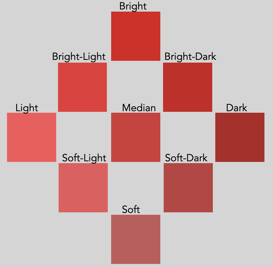
Figure 1: Red in 9 different tonalities
When we know what temperature and tonality a colour has, we can pair it with any colour of the same temperature and tonality to create a harmonious combination.
For example, if we want to pair a cream colour with some of these reds, we would need subtly different creams for each. In Figure 2, I’m showing three examples for various tonalities: dairy cream with the strawberry red (Bright-Light tonality), parchment for the brick red (Soft-Dark), and oat milk for the firetruck red (Bright-Dark), for example.
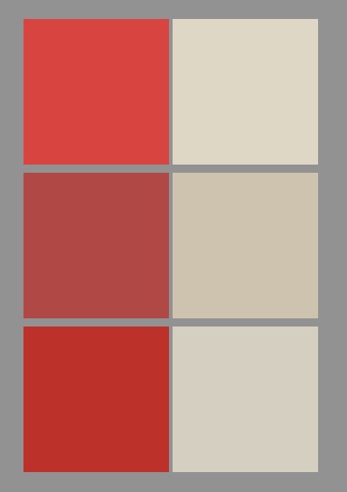
Figure 2: Red with cream in harmonious pairings. From top to bottom: Bright-Light, Soft-Dark and Bright-Dark
Part 2 Looking at colour harmony
Now that we know what colour harmony is, we can focus on what it looks like. We will be considering only solid and clear colours again for this section.
So we find that when colours have the same temperature and tonality, they are harmonious and coexist easily. These colours you can see side by side, and observe them simultaneously. These colours appear exactly as they are, without straining or clashing.
When colours have a different temperature, tonality or both, they are not harmonious and they visually clash. You will have to strain your eyes to look at both colours at the same time, and your vision will side towards on one over the other, or more likely, steer clear entirely and look elsewhere. These colours can’t settle as they are, and your eyes can’t see them comfortably.
And there’s something else that happens. An undertone appears. This is our signal that the colour combination is not harmonious.
‘Wait’, I hear you say, ‘didn’t undertone signal colour harmony? My colour analyst said that I was supposed to look for an undertone when I’m looking for my colours.’
Ironically, yes, that is true. You do need to look for an undertone when you’re swatching colours – except that you DON’T want an undertone to be there. Undertones are, in fact, the indicator of disharmony.
The idea that an undertone is a sign of colour harmony is a hangover from seasonal colour analysis, which is incorrect on so many fronts, I wrote a 12 part article series about it.
There is another kind of undertone too, which is a result of omitting colours from a palette. This doesn’t create a problem for colour harmony. It merely limits your options.
Back to colour pairings. A balanced pairing has no detectable undertones: colours simply coexist. An unbalanced pair develops an undertone in one or both of the colours. It’s like the colours are trying to ‘shed’ a part of themselves. The part of the colour that doesn’t fit with its neighbour, the part that gets in the way, that becomes the undertone. And this is where we learn to look.
Let’s create some examples.
Imagine an acid, lemon yellow, and combine this with a super bright tomato red (Figure 3). That doesn’t make a balanced pairing because these colours have opposite temperatures. The yellow is very cool, the tomato red is very warm. The tomato red develops an orange undertone, since the lemon yellow requires a more pink/blue-leaning red. The yellow, in turn, acquires a green undertone. The tomato red wants a far more golden version of yellow. These combinations are shown in Figure 4.
| | |
| | |
Figure 3: A disharmonious combination: cool yellow with warm red. Depending on where you focus your eyes, you will find an orange undertone in the red, a green undertone in the yellow, or both.
| | |
| | |
| | |
| | |
Figure 4: Red with yellow in harmonious versions: cool on the left, warm on the right.
This example is about undertones in hue, from a mismatch in temperature. From the previous section, we also know that colour harmony requires similar tonality (the ‘paint medium’ that carries the hue)
When we have combinations of the same tonality, colour pairings appear bright, clean, full-bodied and generous. With disharmonious combinations, colours appear with a white, grey or black cast, or are overbearingly loud.
Here is an example (Figure 5). This pairing is of a Soft-Light blue with a Bright-Dark red. And it’s not pretty. The red is heavy and overbearing, with a black undertone. The blue is pale and washed out, with a white cast.
| | |
| | |
Figure 5: Another disharmonious combination: Soft-Light blue with Bright-Dark red
To make the red with blue pairing more balanced, we need to either pick a Soft-Light red to go with the blue, or a Bright-Dark blue to go with the red. In Figure 6, we can see what those look like. Neither causes too much white, black or grey to appear in the other.
| | |
| | |
| | |
| | |
Figure 6: Harmonious blue with red: Soft-Light on the left, Bright-Dark on the right.
So far, we have seen an example of a mismatch in temperature, and one for a mismatch in tonality. However, both can be off. Obviously, that looks much worse.
The example in Figure 7 combines pink with orange, which which human eyes tend to be quite sensitive to. It makes for a particularly offensive pairing.
| | |
| | |
Figure 7: Disharmonious pairing of a cool, Soft orange with a warm Bright pink
Focusing on the pink causes a heavy grey undertone to appear in the orange due to the difference in tonality, and it also has a yellow undertone due to the difference in temperature. Focusing on the soft orange makes the pink overbearingly loud, and much too red-leaning to make a balanced pink.
Therefore, this is what it looks like when I pair them up correctly: a cool Soft pink to go with the gentle orange, and a much warmer Brighter orange to balance the pink (Figure 8).
| | |
| | |
| | |
| | |
Figure 8: Orange with pink, two ways: cool and Soft on the left, warm and Bright on the right.
Just for fun, let’s see what it looks like when flip the temperature and tonality, and I create a warm and Soft pairing, and a cool and Bright one (Figure 9).
| | |
| | |
| | |
| | |
Figure 9: Orange with pink, two more ways: warm and Soft on the left, cool and Bright on the right.
Any of these combinations of orange with pink would work wonderfully in for example a floral print. But you wouldn’t want to mix them up!
The orange with pink in Figure 7 was very obviously disharmonious, as a result of totally opposite temperatures (cool vs warm) and opposite tonalities (Bright vs Soft).
However, sometimes the disharmony is a bit more subtle. When I pair blue and green together, which human eyes tend to be a bit less sensitive to, and I keep the difference in tonality and temperature a bit smaller, this is what that looks like (Figure 10):
| | |
| | |
Figure 10: A subtly disharmonious pairing: a warm Bright-Light green on top; on the bottom, a warm-neutral Light blue.
The disharmony is there, but it’s rather small: the temperature and tonality each differ only one step (warm vs warm-neutral, Bright-Light vs Light). However, you might still be able to see a white undertone in the blue: it is slightly softer and paler. Because blue is naturally darker than green, the blue doesn’t so much appear lighter next to this green. But perhaps you can see that the harmonious blue that this green wants, would be a little fuller and richer, and also a smidge darker
The disharmony in temperature is even more challenging to notice, and is easiest to see from the perspective of the blue: it makes the green ever so slightly too yellow.
All in all, these differences are very slight, and I won’t expect you to be able to see much if this is your first try. This really is a hard one!
Let’s now create the correct pairings and see what they look like (Figure 11).
| | |
| | |
| | |
| | |
Figure 11: Corrected pairings of green with blue: warm Bright-Light on the left, warm-neutral Light on the right.
Subtle differences like the example in Figure 10 can still matter. Especially when I’m doing your colour analysis. When we want to find your settings for temperature and tonality, we want to be as precise as possible.
However, for a real-world shopping result, this kind of combination is pretty ok (there’s so much worse out there!) and I’d say this is probably close enough.
It is good to keep in mind that although disharmonious pairings develop an undertone in one or both colours, the colours aren’t actually doing anything. These effects are happening in your mind. They are a result of human eyes and brain processing vision. In this article, I’m describing the experience of looking at colours with human eyes, not any physical traits or behaviour from the colours themselves.
Now that we can test colour harmony in solid/flat colours, in the next section we’ll move on to what it looks like for your face.
Part 3 Sensing colour harmony
Colour harmony with human skin is a little more complicated than with flat colours. The principle remains the same, for course: the colour we’re wearing has to have the same temperature and tonality as the colours in your skin, for colour harmony to occur.
The difficulty with skin though, is that it has multiple colours at the same time, all layered on top of each other. We want all those colours to easily coexist with the colour you’re wearing. However, there are too many at the same time to really see what’s going on. What’s more, natural skin colours are really muted (close to grey), which makes them difficult to gauge. Differences in temperature or tonality don’t stand out as much. All together, undertones will be difficult to spot.
Colour harmony, when it involves human skin, is no longer about looking. We will need to take a step back from the technical approach and address colour harmony in skin in a more intuitive way. And this is where sensing comes in.
From my previous seasonal training, description we had what colour harmony looks like in someone’s face, was ‘clearing the skin’, which got explained as ‘the absence of negative illusions’. When the colour we’re testing leaves the skin free from excess shadowing, heavy texture, yellowing or redness and various other visual distortions, it is said to be harmonious.
And while this is certainly true, I don’t like to define colour harmony by what it’s not. It leads to an inherent contradiction. Because balanced, healthy human skin still has shadow, texture, redness and yellowness. For example, pores are supposed to be part of your skin (they’re very useful!). So how much visible pores is too much? When we try to measure colour harmony by the things that it is not, we’ll be left wondering what level of measurement is acceptable to declare that the measurement isn’t there.
Instead, over the years of doing colour analysis and developing Sphere colour palettes, my definition has evolved into the following:
Colour harmony is when your skin is able to capture light.
When skin can capture light, we are given the impression that the very light appears to slow down and settle inside. The light pools, fills up the skin, and starts brimming over. The skin becomes luminous and painterly. The face transforms, from a picture to a painting.
In darker skin tones, this lends an incredible depth and fullness to the skin’s hue, and transforms its natural surface shine from ashen to clear, much like the shine on silk velvet. Comparatively, lighter skin tones are less colourful and more transparent. In disharmonious pairings, that transparency reads as wan and waxy, and transforms to a marble-like translucency in harmonious colour combinations.
How does this relate to tonality and temperature?
First, tonality is what brings light into your skin.
For some people, their skin wants a lot of light, and so colour harmony happens with very light and clear colours (Light tonality). For others, their skin finds these colours way to light and buoyant, and they want more grounded, dark colours. For them, it’s richness and depth that brings light into their skin (Dark tonality). Some people find they balance very gentle amounts of colour, and they still look fully lit (Soft). Others might find they require a very strong punch of colour to bring enough light into the skin (Bright). The other tonalities in Sphere colour analysis (Soft-Light, Soft-Dark, Bright-Light, Bright-Dark) have combinations of these effects.
People with Median tonality skin deserve special recognition. They manage to make most Bright, Soft, Light and Dark colours look acceptable. Yet none of them are really satisfying. All these tonalities offer Median skin a small amount of light. Yet none of them really bring enough.
For these people, we only find their sweet spot when we stick to the exact middle of the tonality range: neither Soft, Bright, Light or Dark – but instead Median. And suddenly, the light is there, their skin seizes it, and their appearance transforms.
Tonality is only half the story for colour harmony. What about temperature? After tonality brings light to your skin, temperature affects how well your skin is able to hold it.
It’s like the difference between a bowl and a colander. You can pour water into a bowl, and the water will stay there. That’s what the right temperature does: it allows the skin to hold on to light.
The wrong temperature is like the colander: sure, you can pour water into it, but it’ll pour out almost as quickly. The skin can’t hold on to the light, which appears unstable and fleeting.
So when you have the right tonality and temperature, they work together. The tonality will offer the right amount of light to your skin, while the temperature enables your skin to capture it. When both are at the right setting, that’s when your skin fills up and flows over with light.
I highly recommend trying many different colours on yourself, and practice sensing what your skin does in response. Your clothes, but also household objects, all have colours. Hold them close to your face, and watch your skin change. Does the colour let you capture more or less light? Can it get too much? And what colours allow your skin to hold on to light?
The purpose here is to train your eyes to become sensitive, and thus learn to sense. However, don’t draw conclusions about your own temperature or tonality too quickly. You might find a colour that lets your skin hold on to light, but it may not be obvious what properties it has.
Every colour occurs in a version for every temperature and tonality. Not every pastel belongs to the Lights, and not every dark colour belongs to the Darks. Not every rust brown is warm, not every sky blue is cool.
Which is why Sphere palettes contain so many colours: every hue, in a clear, pastel and dark version is depicted, alongside their appropriate neutrals, while all carefully calibrated for temperature and tonality.
A note about hair and eye colour. Do these play any part? Not really. You can safely assume that your hair and eyes will look fresh and colourful when your skin is able to capture and hold light. If anything, your eyes and hair are probably more tolerant than your skin is. I was taught, back when I was a seasonal colour analyst, that if the skin is in perfect balance, the eyes and hair are automatically too. To this day, I’ve found that to be completely true.
Another note: I am once again describing the visual experience of colour harmony in someone’s face, not the physics. Capturing and holding on to light, in physics terms, means absorption of photons. In that case, nothing would get reflected, consequently no light gets detected by the viewer, and the resulting object or person appears dim. That’s not what I mean. I am trying to convey to you the experience of sensing colour harmony, not the mechanics.
Part 4 Seeing colour harmony
In the previous part, we learned how to sense colour harmony with your skin. However, there is another piece to that puzzle.
We can consider the effects of a colour on your skin, but there is also the effect of your skin back on the colour. And that colour IS a flat colour. Which means it’s by far the easiest to judge colour harmony by.
And because we now can sense when the skin can capture light, we can once again look at the colour. This time, we’re not just looking though. When we look and understand what we’re looking at, that’s when we are seeing.
To summarise: imagine we have a colour, a drape, garment or other item, that we hold under your face. When the colour is harmonious, not only your skin appears as though it can capture and hold on to light. The colour too, should appear to full effect as well.
The beauty about Sphere palettes is that temperature and tonality are laid out independently. We can work on one and ignore the other for the moment.
So let’s start with tonality. We want the colour to simultaneously appear:
- clean (bright enough)
- clear (light enough)
- generous (soft enough)
- full-bodied (dark enough)
A colour that doesn’t look clean, instead will look washed out, worn out, dirty or faded. Too much grey is coming through: in other words, a grey undertone has appeared. Your face requires a brighter colour.
A colour that doesn’t look clear, instead shows up as heavy, weighed down and dim. The colour has too much black in it: a black undertone emerges. Your skin requires the colour to be lighter.
A colour that doesn’t look generous, instead comes across as overbearing, takes up too much space and draws too much attention. We have to strain to really see you. It has too much brightness, and we need it to be softer: a little more white, grey or black to mellow out the brightness with.
Finally, a colour that doesn’t look full-bodied, appears thin, pale, floaty and disconnected from you. There is a white undertone that gets in the way. Your skin requires the colour to be darker.
Colour analysis is about tuning the dials of softer/brighter and lighter/darker until we find balance. That’s how we find your tonality.
Next, when we are testing for temperature, we want the colour to simultaneously appear:
- fresh (cool enough)
- happy (warm enough)
Temperature is about hue. When a hue looks fresh but not really happy, the colour is probably too cool. If a hue looks happy but no longer fresh, it is probably too warm.
If the hue looks very unhappy altogether, that means you are either very far from the temperature that you need, and/or the tonality is completely off. There is definitely crosstalk between these two, and it takes a skilled colour analyst to untangle them. Generally, colour analysis is easy – until it’s not!
I hope this article gave you some insights into how colour harmony looks, and helped you judge if it is there. And if it made you curious about Sphere colour analysis, you can find more information about that here.