Author: Florentina

  • 12 Reasons Against 12 Seasons Part 5

    Lessons from Light Spring

    In previous articles, we learned how every temperature has a full rainbow of hues, and how we adjust those hues by adding a clear, white, grey or black ‘medium’ as the tonality requires. That leads to palettes that each have a version of pink, red, orange, yellow, chartreuse, sap green, true green, turquoise, cyan, blue, purple and violet. 

    But those are just the clear colours. There are other colours in a palette besides: pastels, darks and neutrals. In this article, we will start with pastels. 

    Pastels are often associated with the Light Seasons, as well as the Summers. For good reason: the Lights are a great place to learn more about pastels. Let’s look at what happens in the Lights when we do an imaginary paint mixing experiment. 

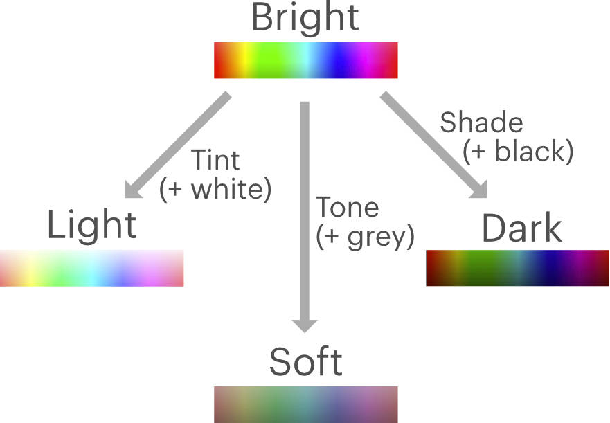
    We start with a paint that is just pure pigment in a clear medium. Since there is nothing to dull or soften the hue with, all of it comes though. That gives a very bright colour. As we have seen before (part 3), this colour belongs in the Bright tonality, since there is no trace of white, grey or black. 

    Now let’s start adding small amounts of white medium to that paint. The white lightens the colour, so we end up with a lighter colour in the Brights. But white also softens our paint colour. As we continue to add small amounts of white, at some point our paint drops below the brightness range of the Brights, and enters the range of the Bright-Light tonality. 

    We continue to add white and the paint becomes lighter and softer still. We descend down the range of the Bright-Light tonality and beyond it, into the range of the Light tonality.

    At this point, the paint is already rather milky, but still works as a rich and bright colour in the Light palettes, because that tonality by definition requires having a large amount of white.

    Still, we add more white medium. The paint becomes lighter and softer still. Now it reaches the very tip of the Light tonality: the lightest a colour can be and still be a clear colour. At this point, we have equal amounts of white and coloured pigment in our paint. It’s 50-50. 

    Now we add a tiny bit more white again. The balance tips. There is more white medium than colour in our paint. The paint is no longer a clear colour, not even for a Light palette. It has become a pastel. 

    This pastel still has quite a lot of pigment, and therefore is quite ‘fruity’ and fairly gentle. Which is just right for a Light tonality pastel. 

    Now let’s continue adding white. Now that our paint has more white than colour, the white we’re adding doesn’t soften the colour anymore. Instead, we’re getting the opposite effect. With every bit of white were adding, the pastel gets ‘louder’, starker and thus brighter. At some point, the colour becomes too bright to remain in the Lights. Our paint has become a Bright-Light pastel. 

    We continue our paint mixing with more white again. The pastel passes through and exits the Bright-Light pastel range, as it becomes whiter and starker. The pastel has now become a Bright pastel, which is typically called an icy. 

    We’ve now used up an extraordinary amount of imaginary paint, and we moved from the Bright clear colours all the way down to the tip of the Light colours. There we encountered the pastel point, the turning point where our clear colour transitioned into a pastel. As we continued to add white, we encountered pastels for the Light, Bright-Light and Bright tonalities. We arrived back where we started and completed our loop.

    Our other tonalities (Soft-Light, Soft, Soft-Dark, Dark, Bright-Dark and Median) also have pastels. These contain a small amount of grey or black to adjust for the grey or black that these tonalities are based on. This is why we didn’t encounter them during our paint mixing experiment, we only added white. But if we were to take the Bright pastel/icy, added a smidge of black to soften and darken the colour, we’d have a Bright-Dark pastel. Double that smidge and we’d have a Dark pastel. The rest works in similar ways. 

    So what have learned from our experiment? Pastels are a class of colours separate from clear colours, that consist of more white than colour, and may contain trace amounts of grey or black. Pastels occur in every tonality. The more white a pastel contains, the brighter it is. 

    Now let’s we look back at the Seasons. There tend to be pastels scattered in here and there, but True Summer is where we find most of them. However, a lot of True Summer pastels actually belong elsewhere (why is it always True Summer?). In fact, a few of my True Summer drapes turned out to be Dark tonality pastels. 

    Given the Soft-Light qualities of True Summer, and pastels being generally soft and light, it is not surprising that these colours get placed there. However, not everything that is soft and light actually belongs to the Soft-Lights. Every tonality has their pastels. 

    Reason 5: Many pastels are placed in the Lighter/Summer seasons, but pastels belong in every palette. 

    So instead: Sphere palettes all received pastels calibrated for their tonality. 

    Now that we understand how mixing with white creates a different tonal class of pastels, we can also imagine how mixing with black creates the tonal class of the darks. Which we will continue learning about in the next article.  
    < Part 4 A Bright Spring Cleaning

    Part 6 In the Depths of Dark Autumn >

  • 12 Reasons Against 12 Seasons Part 4

    A Bright Spring Cleaning

    In the previous parts, we learned that Seasonal palettes are incomplete in terms of hues, mostly as a result of the wrong assumptions about undertone. In this article, let’s look a little closer on what is actually going on inside a palette. 

    In part two, we encountered a lavender purple in the cool True Summer palette that turned out to be pure warm in temperature. The same warm lavender hue, adjusted for brightness, is also often seen in the cool True Winter season. It also occurs in the warm True Autumn, and in several neutral temperature Seasons besides. The fact that the same hue occurs in multiple palettes, all with very different temperatures, should raise questions! 

    Since we know now that lavender purple is warm, we know it is correct in True Autumn, and incorrect everywhere else. Warm colours are not supposed to be in True Summer or True Winter, which are presented as pure cool. Curiously, there is no lavender purple in True Spring, where it should have been included. 

    So for this part of our series, let’s look at what actual temperature and tonality the colours in a given palette have. Are there many cases like the lavender, where it is included in the wrong place? 

    I’m using Bright Spring as an example. Since I don’t own a physical copy of Bright Spring anymore, I found an online picture of one particular Bright Spring palette and digitally eye-dropped the colours. I then resorted them for temperature and tonality, and counted how many ended up in each category. We need to allow for some margin of error, since all of this was done on a screen, and screens always differ from how a palette looks in real life. 

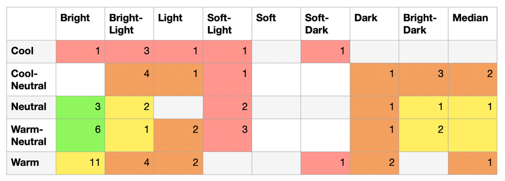
    Here are the results: 

    Ideally, we would expect most of the colours to be in the Warm-Neutral Bright (Sphere D1) and Neutral Bright (Sphere C1) categories, since those are what Bright Spring is supposed to be. This is our green zone, and should form the core of the palette. The reality is that a lot of the colours spread out a quite a bit further. We have only 9 colours in the green zone. 

    However, it is probably for the best that Bright Spring takes on a couple of colours from its direct neighbours, in order to fill the colour space that is not covered by 12Seasons (see previous article). While these colours are already less ideal for genuine Bright Spring people, there are others that do need them. Many of these people will have to be compromised into Bright Spring because they have nowhere else to go. The palette can serve more people that way. 

    Examples are the Warm-Bright (E1) for example, or the Warm-Neutral Median (D5). These cells are coloured yellow and have 18 colours together. Together, that makes 27 colours that are in the ‘Greater Bright Spring Area’. 

    When we spread further still and reach two steps away from Bright Spring, I admit I’m not really comfortable with that. An example is the Cool-Neutral Bright-Light (B2): having cool-neutral colours in Bright Spring just feels wrong. 

    What’s more, some of these categories are already covered in other seasonal palettes. For example, having colours in the Warm-Neutral Light (D4) category is not necessary, because that’s where Light Spring lives. These categories are labeled orange. Collectively, the orange cells contain 24 colours. 

    Going even further away is a hard no, in my opinion. Cool colours have no business being in Bright Spring whatsoever, as do the Soft-Light and Soft-Dark tonalities. Nevertheless, we have 14 colours in this red zone. 

    All in all, the spread is rather large. I personally would like a lot more colours (at least 50%) to be in the green zone, and to have significantly fewer in the orange zone, and absolutely none in the red zone. Instead, the red and orange zones together have 38 colours: 11 more than the green and yellow zones together. 

    Which means that the majority of Bright Spring isn’t actually Bright Spring – at least in my digital experiment. If we take into account that my online swatching was probably less than ideal, the more cautious conclusion is that the Bright Spring palette is probably more random than it should be. 

    All of this doesn’t just apply to Bright Spring. I tried this exercise with other palettes, and it was the same story everywhere. Every temperature and at least half of the tonalities popped up in every palette. In the cool-neutral Bright Winter, the pinks reach all the way to warm. In True Autumn (Warm Soft-Dark, E8), the limes are Soft and the green is pure cool. 

    In conclusion, Seasonal palettes are not always ‘what it says on the tin’. 

    Nevertheless, I believe it is important that a palette contains what it is meant to. The very purpose of a palette is to communicate to a client which colours are relevant to them. I will never expect a client to know that one particular colour is in their ‘orange zone’, because it happens to be a fair bit cooler/warmer/brighter/softer/lighter/darker than it should have been- except that they will find out, eventually. The hard way. 

    Therefore, the Sphere palettes contain only colours with their exact temperature and tonality. There’s not even any need for a palette to do double duty for the neighbouring category, since all categories are covered from the beginning. 

    Reason 4: Seasonal palettes contain a lot of colours from other temperatures and tonalities. 

    So instead: Sphere palettes are tightly calibrated to contain only their own temperature and tonality. 

    Now that we’ve cleaned up all the colours that shouldn’t be in a palette of a given temperate and tonality, in the next part we’ll look at what colours should be included, as I continue creating the Sphere palettes. 

    < Part 3 Tonality and the not-so-Bright Winter

    Part 5 Lessons from Light Spring >

  • 12 Reasons Against 12 Seasons Part 3

    Tonality and the not-so-Bright Winter

    So far, we’ve been researching colour interactions by focusing on temperature, which comes from hue. But temperature alone doesn’t make colour harmony. Colours have other characteristics: value (light/dark quality) and chroma (a measure of brightness). Together, these are captured in tonality – the other component that creates harmony. Let’s have a look.

    The easiest way to think of tonality is as a paint medium that carries the pigment, or hue. By considering the ‘paint medium’ separately from hue, we can consider the Seasonal palettes independent from their temperatures, and we are left with just their tonality.

    When we start with a completely clear medium, all the pigment shines through. We end up with Bright colours. The clear medium is what makes a Bright Season’s tonality. 

    If the paint medium is not clear, and instead contains grey, white or black, the clarity of pigment or hue will be dampened. We get softer colours, depending on how much of the white, grey or black we’re having. In addition, they may also be lighter (when mixed with white) or darker (when mixed with black). 

    White, grey or black can be used to create the other tonalities found in the Season circle. 

    The Lights are made by having a white base to which the hues get added (in art class, we call these colours ‘tints’). The Darks are made by having a blacked medium to which the hue component gets added. (Art class calls these ‘shades’). And finally, the Soft tonality has a dense grey medium mixed in with the colours (In art, these are called ‘tones’). 

    So now we have Brights, Lights, Softs and Darks by adjusting how much white, grey and black is in our paint medium. 

    Additionally, the Season circle contains the so-called True Seasons. They are located in-between the Brights, Lights, Softs and Darks. We can summarise their tonality, their paint medium, independent of what temperature they have, by calling them:

    • Soft-Light for True Summer, as it sits exactly between the Lights and Softs; 
    • Soft-Dark for True Autumn, since it is positioned halfway between the Softs and Darks; 
    • Bright-Dark for True Winter, since it is in between the Darks and Brights; and
    • Bright-Light for True Spring, as it is placed between the Brights and Lights. 

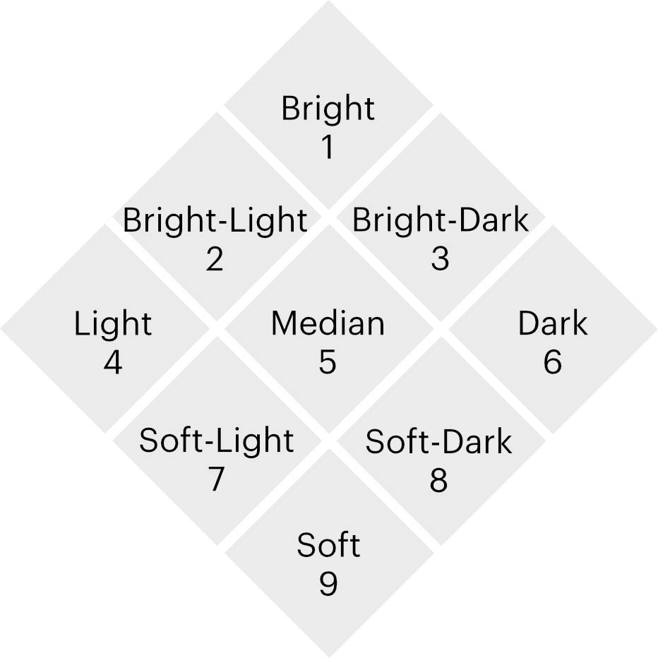
    So now we have 8 tonalities: Bright, Bright-Light, Light, Soft-Light, Soft, Soft-Dark, Dark, and Bright-Dark. These would form the basis for the Sphere palettes that I designed. 

    However, something is still missing. Let’s look a little more in-depth. 

    If we start with Bright, and add a full dose of white ‘medium’, we end up with the Light tonality. When we only add half the amount of white, we have the Bright-Light tonality instead, which is halfway between them by definition. In the same way, Bright-Dark contains half the amount of black compared to Dark. 

    But with adding grey medium, there’s something weird going on. There is no in-between step. There is either Bright, with no grey whatsoever, or Soft, which received a very large dose of grey. 

    So that’s why I am introducing a Median tonality in the Sphere system. Median has half of the amount of grey that the Softs have. It is positioned right between Bright, Soft, Light and Dark, sitting at the centre of the tonality range.

    Now what happens when we bring temperature back in?

    In the Season system, each of the original 8 tonalities are coupled to specific temperatures. For example, Soft-Light is always coupled with cool temperatures into True Summer. Dark tonalities are only cool-neutral as Dark Winter or warm-neutral as Dark Autumn, but never cool or warm.

    However, brightness doesn’t dictate what hue a colour should have. It could be anything. There’s a full spectrum of hues available at each brightness level. And we already know from part one that if we have a full spectrum, then we have all temperatures. Therefore, temperature and tonality are independent variables: you can have any tonality in any temperature. 

    For colour analysis, this has far-reaching consequences! These are easiest to visualise in a table. In this table, we have a list of all the tonalities along the top, and at the left hand, a list of all the temperatures. In addition, I’ve filled out all the Seasons in their correct places. 

    BrightBright-LightLightSoft-LightSoftSoft-DarkDarkBright-DarkMedian
    CoolTrue SummerTrue Winter
    Cool-NeutralBright WinterLight SummerSoft SummerDark Winter
    Warm-NeutralBright SpringLight SpringSoft AutumnDark Autumn
    WarmTrue SpringTrue Autumn

    You might notice, there is a lot of space left over (empty cells). These represent all the combinations of tonality and temperature that do not occur in the Season circle at all. Each empty cell represents an entire family of harmonising colours, that are left out of the system entirely. Which means that 2/3 of the possible combinations are not covered by the Seasons! 

    I find this is genuinely shocking. For a system that is supposed to be able to categorise everyone, this is abysmal, and more than a bit embarrassing. Two-thirds of people are going to leave with a palette that doesn’t fit them (assuming equal distribution). 

    Small wonder I had clients in their final drapes that didn’t look as great as I wanted them to! The lucky ones have a temperature and tonality that coincides nicely with the options available in 12Seasons. The others didn’t. 

    The large number of missing categories also explains the large number of Bright Winter clients I’ve seen over the years. A significant portion of them were ‘not-so-Bright Winters’, which in hindsight would have been a Bright-Light, Bright-Dark, or Median. Bright Winter was simply the best compromise available, not their best palette. 

    In addition, this table also explains why colour analysis is hard. Spotting colour harmony when someone’s temperature and tonality align perfectly with one particular Season, is actually straightforward. But going round in circles (pun very much intended) and trying to find the least awkward compromise when nothing is a perfect fit, that is hard and will always remain so. 

    Whenever we felt that our results didn’t work as well as promised, we just blamed ourselves (I’m speaking now as both client and analyst). Instead, we should have questioned the system!

    The table also beautifully explains how the same person can get different results. Especially the Median tonality, which can be analysed as a Bright Winter by one analyst, as a Soft Summer by another, and as a Dark Winter by the next. What this person needed all along was a Cool-Neutral Median palette – which needless to say, doesn’t exist in 12Seasons. It’s the gap at the centre of the circle, hiding in plain sight. Trying to place somebody like this in a Season regardless, will always result in a compromise. 

    How you compromise is mostly a matter of personal preference of the analyst. Are you irked more by a colour being slightly too loud, or slightly too dark? We can argue about which is better till the cows come home, but what we haven’t done is provide the client with the colours that they need. 

    Additionally, this also explains why colour analysis at large is seen as subjective rather than scientific discipline by the general public. I will confess, they turned out to be right! Objective colour analysis is definitely possible, just not when you handicap yourself unintentionally by leaving out 2/3rds of all categories. 

    Creating this table was an eye-opening exercise. I’ve since gotten used to thinking of colour harmony as two independent variables. Now it strikes me as completely bizarre that we have only two tonalities available for people who need cool or warm temperatures, and only four for people who need neutral temperatures. 

    If we want to analyse people accurately, rather than only having the 12 preset combinations, it is crucial to have every combination available. 

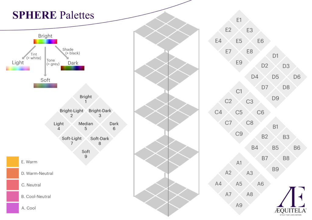
    Naturally, when I designed the Sphere system, it became an obvious choice to create a palette for every combination of temperature and tonality. I chose to have 5 temperatures, labeled 

    A) Cool,
    B) Cool-neutral,
    C) Neutral,
    D) Warm-neutral
    E) warm.

    Plus we have the 9 tonalities we discovered just now (all 8 from the Season circle, plus the Median), labeled
    1) Bright,
    2) Bright-Light,
    3) Bright-Dark,
    4) Light,
    5) Median,
    6) Dark,
    7) Soft-Light,
    8) Soft-Dark 
    9) Soft. 

    That gives 5 x 9 = 45 total palettes, from A1 to E9. 

    Since tonality is already a two-dimensional variable, while temperature is just one dimension, the entire Sphere system becomes a 3 dimensional ‘tower block’. Each floor in the tower represents a temperature, and each little square per floor is a tonality. That way, every person has access to a palette that has their specific combination of tonality and temperature. 

    < Part 2 True Summer and the overdone undertone

    Part 4 A Bright Spring Cleaning >

  • 12 Reasons Against 12 Seasons | Intro

    And How Researching Colour Science Led Me To Create SPHERE Palettes Instead

    Intro

    I thought I had the colour analysis part of my style business all figured out. I was a certified personal colour analyst, trained in the Sci/Art method, after all. Sci/Art works with 12 colour ‘Seasons’, which are colour palettes loosely inspired by the times of the year, to be used for clothing, makeup and accessories. ‘Your’ Season is the one that supposedly has all the colours that look the best on you. It was the best system I could find.
    Yet there were times where my best efforts fell short.

    Not every client’s final Season reveal was all that glowing. For the longest time, I was baffled. Why did some people look radiantly beautiful in their final Season’s drapes, while someone else looked only okay – not all that different from the way they came in? What did I do wrong?

    Over the years, more questions came up. Why did that drape work only on a portion of my Bright Spring clients? Why did I drape so many Bright Winters? Why did that lipstick work only for some of the Dark Winters? Were there really people between Seasons? Why did none of the Bright Winter makeup work on myself?

    Gradually, the questions stacked up into one very pointed question: how did colour harmony work? What made some colours go together beautifully, while others clashed?

    Three years ago, that question didn’t want to remain quiet any longer.

    I am a researcher by training. The gears in my mind started whirring again. It was time to hold up a yardstick to colour science, and see if any of it measured up.

    I knew I needed to start from scratch. Trying to improve the seasonal system would only lead me to regurgitate another version of the same thing. There are enough Seasonal colour palettes that riff on the same ideas, not to mention shameless copies. If I wanted to figure out colour harmony, I had to dig deeper. More importantly, by starting from scratch, I prevented myself from getting stuck in other people’s thought patterns and potential mistakes. If the Seasons were truly harmonious, they would re-emerge.

    So my entire stash of colour palettes got locked away in a box. I mentally prepared myself to question everything I thought I knew about colour. I bought some paint fans from the hardware store, cut them up into chips, and started studying.

    Trigger warning: If you feel the Seasonal system is perfect and you don’t want to hear about what could be different or improved, then this is not the article for you. It’s fine to stop reading. I’m not here to convince you to stop engaging in something you love.

    But for those of you that are wondering, who have perhaps had analyses that didn’t work as well as you hoped? For you, I have answers.

    In this article series, I’m sharing everything that I found about how colour harmony really works – how the Seasonal system fell short, over and over again. And how I built a new system that fixed it all, called Sphere.

    Pablo Picasso once said: “Every act of creation is first an act of destruction”. Well, that proved to be true.

    Part 1 Temperture and True Spring >

  • 12 Reasons Against 12 Seasons Part 2

    True Summer and the overdone undertone

    In part 1, we solved our first question about colour harmony: temperature. We discovered how each hue comes in each temperature. That resulted in a complete spectrum of colours, a full rainbow, in each temperature. 

    Having a full rainbow in each temperature has surprising consequences: the undertones disappear. 

    In the seasonal system, undertones are heralded as the hallmark of colour harmony. When a palette has a unifying cast of a certain colour across the entire spread, such as the bronze in True Autumn or the terra cotta feeling of Soft Autumn, that is taken as the quality that ties these colours together ‘naturally’. 

    Nowhere is this more visible than in True Summer. The True Summer has a strong cast of hydrangea blue all over the entire palette: bluish pinks, bluish greens, actual blues, blueish purples and bluish greys. The only thing not blueish is a very watery yellow, and depending on what make of palette you have, you might get a blueish red. But it absolutely never contains any orange or lime. Because that would contradict the undertone. 

    What even is an undertone? The answer depends whether you are referring to 1) a singular solid colour; 2) groups of colours or colour palettes; or 3) human skin and/or foundation. We will not be considering the skin and makeup undertones in this article (that is going to be a discussion for another day). 

    An undertone in a flat colour is when a hue has a strong lean towards one of its neighbours on the colour wheel. You can have a red with a blue undertone, which means it’s a red that sits closer to magenta, or a red with an orange undertone, which means it’s closer to, well, orange. So far so good. 

    This kind of undertone is unobtrusive when a colour is by itself, but becomes a great deal more visible when you put two colours together. The two reds from the previous example both look like ‘just red’ when by themselves. However, place them side by side and you will clearly see their blue and orange undertones.

    Which brings us to undertones of groups of colours, or colour palettes. These are built up of two things: the apparent undertones of the individual colours from the previous example, and the sections of the colour wheel that are mostly represented. When both coincide, they reinforce each other and thus create the undertone of a palette. As we’ve seen in our True Summer example, a lot of the colours have a blue undertone (= leaning towards blue within their hue), and they are mostly grouped on or near the blue region of the colour wheel. The overarching effect is blue. 

    While that sounds great in theory, something here goes wrong. Let’s go back to the undertone of singular colours for a moment.

    When we placed our two reds together, one orange-leaning and the other blue-leaning, we were able to see how they were different straight away. But there was another thing we might notice: these reds absolutely don’t look good together. 

    In other words: they don’t harmonise. The reason is quite obvious: our reds have different temperatures. When you force reds of different temperatures together, they clash. 

    This clash doesn’t just happen between reds, but between any pair of hues with different temperatures. 

    To summarise: whenever you put colours of (too) different temperatures together, their undertones act up and the colours clash. When you place colours of the same (enough) temperatures together, their undertones settle down and disappear, and the colours harmonise. 

    We have actually already been draping like that. Imagine a very cool, acid yellow drape fabric, typically from True Winter. When we put that drape on somebody who needs a warmer temperature, the yellow starts misbehaving. We see a strong blue cast to it, it almost looks like a lime green. It cannot, would not, will not settle down as yellow. It’s cool blue undertone is wreaking havoc. 

    However, when we put that drape on someone who does need a pure cool temperature, the blue cast disappears. The colour settles. It’s just yellow now, fresh and happy. Harmony is achieved, because the undertone is gone. 

    This part is important. Hues of the same temperature just leave each other be. They don’t cause an undertone to appear in each other. That is what colour harmony is: colours coexisting peacefully and not getting in each other’s way, as perceived by human vision. 

    The moment you do see an undertone appear in one colour or both, is when the temperatures are too different. The colours clash. Nothing wants to settle and we don’t experience colour harmony. 

    Ultimately, undertones in singular colours are a sign of disharmony.

    A beautiful example are the lavender purples in True Summer. As it happens, lavender purple is a very warm colour. Cooler purples are more red-based. (Tangent observation: not everything that ‘leans blue’ has a cooler temperature. It works for red and green, both of which get cooler with more blue, but not for purple or violet, and other hues besides.) 

    Against the cool greens and blues that are also in True Summer, our lavender purple clashes in temperature and develops a strong blue undertone. Since that reinforced the blueness of the palette, we took it as a sign of harmony, when it was in fact the opposite. 

    And admittedly, because the purple is so blue-leaning, it does not stand out nearly as much as a wrong yellow or red would. If we were to try and place a too-warm red in True Summer, the resulting orange undertone would be much more jarring. Yet those purples remain warm, and will have every True Summer turn a bit sallow. 

    So what does that mean for palettes? When you have all hues calibrated to the same temperature, all colours appear just as they are, without undertone in any of them. And when you include all possible hues from around the colour wheel, there are no dominant regions of the colour wheel. For both these reasons, harmonious and complete palettes are free from undertones. 

    However, undertones created by leaving out regions of the colour wheel, are still important for curating and storytelling, and we’ll dive deeper into that at a later point in this article series. 

    Reason 2: Undertone is incorrectly assumed to be a sign of harmony. 

    So instead: Sphere palettes are free from undertones

    Now we have hue and temperature figured out, we will shift our focus on the other components of colour harmony: brightness and value (light/dark). 

    < Part 1 Temperature and True Spring

    Part 3 Tonality and the not-so-Bright Winter >

  • 12 Reasons Against 12 Seasons Part 1

    Temperature and True Spring

    How do you even begin researching colour harmony? 
    By breaking down the question into smaller, more manageable questions. From my training and experience, I knew that colour temperature was a big factor in how colours interact. So that’s where we are going to start. Our first simpler question is: how does colour temperature work? 

    To answer that, we need to simplify even further. Rather than focusing on temperature interactions between colour and human skin, which has a lot of colours together, we’re going to focus on solid, flat colours first. 

    What do we know about temperature? Temperatures are often assigned to certain hues based on how they make us feel: red, orange and yellow are called warm colours; and green, blue and purple are called cool colours. 

    However, if that’s how temperature worked, all we would do is chop the colour wheel in half. We’d end up with a ‘warm’ palette that has every version of red, orange and yellow but which lacks any green, blue and purple; and a ‘cool’ palette that contains every green, blue and purple but lacks any form of red, orange and yellow. 

    That does not make for very satisfying palettes. What’s more, it doesn’t agree with real-world observations. Acid yellow is a cool colour. Cool red is a thing. Warm blue is real. How do we settle these apparent contradictions? 

    The answer lies in distinguishing between absolute and relative temperature. Saying red, orange and yellow somehow feel warm, while green, blue and purple feel cool, is about assigning them absolute temperatures. Those are emotional qualities, important for art and colour psychology. 

    But for studying colour harmony, we’re interested in relative temperatures. Relative temperatures are about distinguishing between cool and warm versions within each hue. 

    Take for example yellow. Yellow comes in a warm version: golden, rich and buttery, leaning very much towards orange; and also in a cool version: acidic, clean and clear, leaning towards lime green. That cool yellow harmonises with other cool colours, such as a cool green or blue. Meanwhile, the warm yellow clashes with these cool colours, and harmonises with other warm colours, such as warm green and warm blue. 

    From Seasonal colour analysis, we are used to having more levels for temperature than just warm and cool. Traditionally, there are four levels: cool, cool-neutral, warm-neutral and warm. For designing my own Sphere palettes, I chose to go more precise with five levels: cool, cool-neutral, neutral, warm-neutral and warm. Therefore, all I had to do was sort all the hues on the colour wheel into five levels of temperature. 

    If that sounds easy, it was not. I didn’t know how many hues there were, where the boundaries between them were, or even what they looked like. It was like laying a puzzle that didn’t come with a picture on the box, didn’t have any edges, where you had to make the puzzle pieces first, and while not knowing how many pieces you need. 

    It took me many many months of moving around paint chips and printing swatches. In true storybook fashion, it was on Christmas Eve, that I finally solved the temperature question. The first leg of creating the Sphere palettes was complete. 

    When sorting hues into a version for each temperature, what do you end up with? You get a full rainbow in each temperature: a version of pink, red, orange, yellow, lime, sap green, true green, turquoise, cyan, blue, purple and violet. 

    But, I hear you ask, a cool orange? That’s always warm, isn’t it? 

    It’s not, actually. Orange has warm and cool versions like any hue out there. Yet for the sake of the argument, let’s think this through. If we were to determine that cool orange can’t exist because orange always feels warm to you, then by that logic, warm blue also cannot exist. Because blue always feels cool, right? Yet it is an accepted part of True Spring, which is characteristically warm. 

    Once again, this is why we distinguish between absolute and relative temperatures. Otherwise we’re back to chopping the colour wheel into two chunks and calling it a day. 

    If you want an example of a cool orange, ironically the best example are oranges – the fruit that shares its name with the colour. Warm orange is closer to red, like an almost-ripe tomato.

    The Seasons lean partly on absolute temperature instead of relative temperature, and so have hues missing in a lot of places. Cool oranges, yellows, limes and sap greens are largely absent in True Winter and especially True Summer. Meanwhile, True Spring, known for its rainbow of clear colours, is the Season that has most of its hues complete (it lacks only purple). 

    This was the first reason against the 12 Seasons I encountered when creating the Sphere palettes. It turns out that there are no hues that are specific to warm or cool temperatures, and no need for True Spring to have a complete rainbow. Every hue occurs in every temperature. 

    Reason 1: Seasons are incomplete in their hues. 

    So instead: Sphere palettes contain all 12 hues in each temperature

    If you are familiar with the Seasons, you may have trouble imagining what palettes look like with a full rainbow of hues included. Wouldn’t that contradict the undertone? That’s what the next article is about. 

    < Intro

    Part 2 True Summer and the Overdone Undertone >