Tonality and the not-so-Bright Winter
So far, we’ve been researching colour interactions by focusing on temperature, which comes from hue. But temperature alone doesn’t make colour harmony. Colours have other characteristics: value (light/dark quality) and chroma (a measure of brightness). Together, these are captured in tonality – the other component that creates harmony. Let’s have a look.
The easiest way to think of tonality is as a paint medium that carries the pigment, or hue. By considering the ‘paint medium’ separately from hue, we can consider the Seasonal palettes independent from their temperatures, and we are left with just their tonality.
When we start with a completely clear medium, all the pigment shines through. We end up with Bright colours. The clear medium is what makes a Bright Season’s tonality.
If the paint medium is not clear, and instead contains grey, white or black, the clarity of pigment or hue will be dampened. We get softer colours, depending on how much of the white, grey or black we’re having. In addition, they may also be lighter (when mixed with white) or darker (when mixed with black).
White, grey or black can be used to create the other tonalities found in the Season circle.
The Lights are made by having a white base to which the hues get added (in art class, we call these colours ‘tints’). The Darks are made by having a blacked medium to which the hue component gets added. (Art class calls these ‘shades’). And finally, the Soft tonality has a dense grey medium mixed in with the colours (In art, these are called ‘tones’).
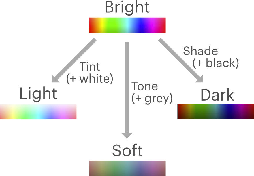
So now we have Brights, Lights, Softs and Darks by adjusting how much white, grey and black is in our paint medium.
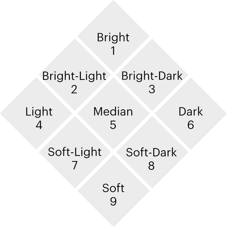
Additionally, the Season circle contains the so-called True Seasons. They are located in-between the Brights, Lights, Softs and Darks. We can summarise their tonality, their paint medium, independent of what temperature they have, by calling them:
- Soft-Light for True Summer, as it sits exactly between the Lights and Softs;
- Soft-Dark for True Autumn, since it is positioned halfway between the Softs and Darks;
- Bright-Dark for True Winter, since it is in between the Darks and Brights; and
- Bright-Light for True Spring, as it is placed between the Brights and Lights.
So now we have 8 tonalities: Bright, Bright-Light, Light, Soft-Light, Soft, Soft-Dark, Dark, and Bright-Dark. These would form the basis for the Sphere palettes that I designed.
However, something is still missing. Let’s look a little more in-depth.
If we start with Bright, and add a full dose of white ‘medium’, we end up with the Light tonality. When we only add half the amount of white, we have the Bright-Light tonality instead, which is halfway between them by definition. In the same way, Bright-Dark contains half the amount of black compared to Dark.
But with adding grey medium, there’s something weird going on. There is no in-between step. There is either Bright, with no grey whatsoever, or Soft, which received a very large dose of grey.
So that’s why I am introducing a Median tonality in the Sphere system. Median has half of the amount of grey that the Softs have. It is positioned right between Bright, Soft, Light and Dark, sitting at the centre of the tonality range.
Now what happens when we bring temperature back in?
In the Season system, each of the original 8 tonalities are coupled to specific temperatures. For example, Soft-Light is always coupled with cool temperatures into True Summer. Dark tonalities are only cool-neutral as Dark Winter or warm-neutral as Dark Autumn, but never cool or warm.
However, brightness doesn’t dictate what hue a colour should have. It could be anything. There’s a full spectrum of hues available at each brightness level. And we already know from part one that if we have a full spectrum, then we have all temperatures. Therefore, temperature and tonality are independent variables: you can have any tonality in any temperature.
For colour analysis, this has far-reaching consequences! These are easiest to visualise in a table. In this table, we have a list of all the tonalities along the top, and at the left hand, a list of all the temperatures. In addition, I’ve filled out all the Seasons in their correct places.
| Bright | Bright-Light | Light | Soft-Light | Soft | Soft-Dark | Dark | Bright-Dark | Median | |
| Cool | True Summer | True Winter | |||||||
| Cool-Neutral | Bright Winter | Light Summer | Soft Summer | Dark Winter | |||||
| Warm-Neutral | Bright Spring | Light Spring | Soft Autumn | Dark Autumn | |||||
| Warm | True Spring | True Autumn |
You might notice, there is a lot of space left over (empty cells). These represent all the combinations of tonality and temperature that do not occur in the Season circle at all. Each empty cell represents an entire family of harmonising colours, that are left out of the system entirely. Which means that 2/3 of the possible combinations are not covered by the Seasons!
I find this is genuinely shocking. For a system that is supposed to be able to categorise everyone, this is abysmal, and more than a bit embarrassing. Two-thirds of people are going to leave with a palette that doesn’t fit them (assuming equal distribution).
Small wonder I had clients in their final drapes that didn’t look as great as I wanted them to! The lucky ones have a temperature and tonality that coincides nicely with the options available in 12Seasons. The others didn’t.
The large number of missing categories also explains the large number of Bright Winter clients I’ve seen over the years. A significant portion of them were ‘not-so-Bright Winters’, which in hindsight would have been a Bright-Light, Bright-Dark, or Median. Bright Winter was simply the best compromise available, not their best palette.
In addition, this table also explains why colour analysis is hard. Spotting colour harmony when someone’s temperature and tonality align perfectly with one particular Season, is actually straightforward. But going round in circles (pun very much intended) and trying to find the least awkward compromise when nothing is a perfect fit, that is hard and will always remain so.
Whenever we felt that our results didn’t work as well as promised, we just blamed ourselves (I’m speaking now as both client and analyst). Instead, we should have questioned the system!
The table also beautifully explains how the same person can get different results. Especially the Median tonality, which can be analysed as a Bright Winter by one analyst, as a Soft Summer by another, and as a Dark Winter by the next. What this person needed all along was a Cool-Neutral Median palette – which needless to say, doesn’t exist in 12Seasons. It’s the gap at the centre of the circle, hiding in plain sight. Trying to place somebody like this in a Season regardless, will always result in a compromise.
How you compromise is mostly a matter of personal preference of the analyst. Are you irked more by a colour being slightly too loud, or slightly too dark? We can argue about which is better till the cows come home, but what we haven’t done is provide the client with the colours that they need.
Additionally, this also explains why colour analysis at large is seen as subjective rather than scientific discipline by the general public. I will confess, they turned out to be right! Objective colour analysis is definitely possible, just not when you handicap yourself unintentionally by leaving out 2/3rds of all categories.
Creating this table was an eye-opening exercise. I’ve since gotten used to thinking of colour harmony as two independent variables. Now it strikes me as completely bizarre that we have only two tonalities available for people who need cool or warm temperatures, and only four for people who need neutral temperatures.
If we want to analyse people accurately, rather than only having the 12 preset combinations, it is crucial to have every combination available.
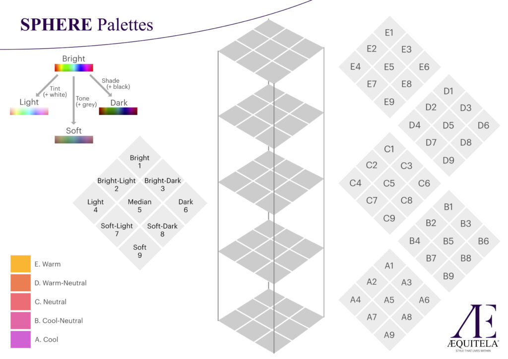
Naturally, when I designed the Sphere system, it became an obvious choice to create a palette for every combination of temperature and tonality. I chose to have 5 temperatures, labeled
A) Cool,
B) Cool-neutral,
C) Neutral,
D) Warm-neutral
E) warm.
Plus we have the 9 tonalities we discovered just now (all 8 from the Season circle, plus the Median), labeled
1) Bright,
2) Bright-Light,
3) Bright-Dark,
4) Light,
5) Median,
6) Dark,
7) Soft-Light,
8) Soft-Dark
9) Soft.
That gives 5 x 9 = 45 total palettes, from A1 to E9.
Since tonality is already a two-dimensional variable, while temperature is just one dimension, the entire Sphere system becomes a 3 dimensional ‘tower block’. Each floor in the tower represents a temperature, and each little square per floor is a tonality. That way, every person has access to a palette that has their specific combination of tonality and temperature.